How do letters appear on our screens, these exquisite expressions of design, our Baskerville so clearly differentiated from the Caslon and Comic Sans that we recognize instantly what font families we are inviting into view? […] Our concepts of what the letters are, as well as their literal forms, have migrated from scratched stone and inked surface to screen. […] What are the letters? Did our ancestors ask this, as they formed their proto-Canaanite glyphs in the early part of the second millennium B.C., as the alphabet emerged in a cultural exchange between cuneiform scripts and hieroglyphic signs? If they did, they left no trace of these ruminations. The earliest recorded reflections on the letters, their origins and their identity, come from the Greeks almost a thousand years later. […] They were indeed aware of the differences among sign types and systems. Plato had been to Egypt, and his investigation of self-evident signs and the myth of mimesis, The Cratylus, bears within it a mistaken conviction that the hieroglyphics he had seen on monuments abroad had a capacity to communicate directly with the eye. […]
The alphabet was not invented but emerged […] from the same common root, which tracks to the lands of Canaan, Accad, Moab, Byblos, Sinai, and other realms whose names haunt the biblical history of a region of the Middle East that stretched in a fertile crescent from Mesopotamia to northern Africa.11
Seth Sanders, The Invention of Hebrew (Urbana: University of Illinois Press, 2009). Its origins are intertwined with the histories of nations and peoples whose inscriptions provide a piecemeal record of the first appearances of a system of signs that was neither cuneiform, nor hieroglyphic, nor syllabic, logographic, or ideographic, but alphabetic (letters used to represent phonemes). […]
But the question that guides our investigation into the paradox of letters on the screen, the tension between the atomistic and systemic identities of these forms, remains much as it has been for centuries—not simply “What is the alphabet?” but “How does the alphabet function according to the ways we may conceive it?” […] Thus the answers have implications for our current condition, for the unacknowledged hegemonic hold of the Western alphabet on computational processing, on its infiltration into the very structure of the networked world in which its ASCII, Unicode and BinHex systems operate. […]
The development of contemporary modes of production, that is, the design problems of technological migration, could be studied by looking at the career of an individual designer. One example is the justly renowned Matthew Carter, who began with lessons in stone carving from his father, accompanied by exercises in calligraphy, before becoming involved in each successive wave of design production, from hot type (lead) to cold (photographic), and digital, from the earliest pixels wrangling to programmable fonts (variable fonts)  whose variants are produced through an algorithm generating random variations.22 Margaret Re, Typographically Speaking: The Art of Matthew Carter (New York: Princeton Architectural Press, 2003). When he worked on designs of phototype, his training stood him in good stead, his eye was attuned to the difficulties of scale and the need to compensate for the ways in which light spreads as it goes through a negative and onto a photosensitive surface, clotting the finer elements of letters at the points where strokes connect or where serifs meet strokes. To correct these visual awkwardnesses, for the fattening of the ankles or swelling of the bellies or filled-in counters, the designer has to chisel away bits of the letter at a microscale so that the projected light coming through the film strip negative onto the photosensitive paper would not result in clumsy forms.
 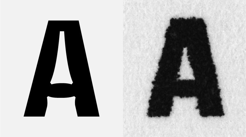 Retrospectively, phototype seems physical, direct, only moderately mediated in contrast to digital fonts, whose identity as elements is stored, kept latent, waiting for a call by the machine to the file that then appears on screen or passes into a processing unit on a device. […]
But what to draw? Consider the complexity of the problem. Carving curved letters in stone is difficult, but inscription is direct. Description ;the indication of a set of instructions for drawing produced by a design—remediates the direct process. Bitmapped fonts could be hand-tuned so that pixel locations could be defined for every point size. […] Outline fonts had to be stored as a set of instructions for rendering the outline of the glyph, with the instructions for filling in provided by the printer. […] A distinction between screen fonts and printer fonts enabled printer-specific files to communicate ways of drawing and making letters. As laser printers came into use (Apple LaserWriter, 1985), graphical expressions became more refined, and the demands on systems of processing and memory increased. The distributed aspects of a font’s existence had to be considered across an array of operations. Challenges of graphic design led to encounters with questions of ontology and identity.
From the outset, digital fonts had to be created across a life cycle of design, storage, processing, display, and output in environments that each had different requirements and protocols. The earliest output devices were plotter pens and dot matrix printers, primitive graphical means at best. They created crude versions of letters whose patterns of dark spots in a grid bore little resemblance to font designs. The pixelated letters on early blinking amber and green screens had the grace of punch card patterns and were as refined as cross-stitch. […] But what produced these letters? What was being stored where, and how? Digital fonts explode any illusion on which stable, fixed, atomistic autonomy could be based. Even at the level of their graphic identity, letters have only to be able to be distinguished from each other, not hold their own as pictorial shapes.
Designs for typography on personal computers began to take shape in the mid-1980s, before fonts had any connection to networking activities. The basic problem of how to create the illusion of curves in a world of pixels forced designers into a choice between vector graphics and the tapestry world of pixels. Scalable vector graphics, designed with Bézier curves spaced at close enough intervals to create nuanced transitions from thin to thick, swelling shapes, and neatly nipped points of connection between strokes, required a great deal of memory. […]
The choice of what to store—a glyph outline, curves and points, or a pixel pattern— had consequences at every step of the font’s life cycle. The creation of TrueType [1991], Apple’s way to store outline fonts, was meant as competition for Adobe’s Type 133
“PostScript fonts,” Wikipedia, http://b-o.fr/postscript_en [Editor’s Note] fonts used in PostScript. The great advantage of TrueType and Adobe’s Type 1 fonts was scalability ;the same design could be redrawn in any size, or so it seemed.44 Thomas Phinney, “TrueType and Post ScriptType 1: What’s the Difference?,” Truetype Typography, (2011), http://b-o.fr/truetype Experiments with Multiple Master [MM] fonts, such as Minion, [1990] played (briefly) with the computer’s capacity for morphing letterforms across a set of variables. But each size of a font requires rework, and in the digital design world, this is referred to as hinting. 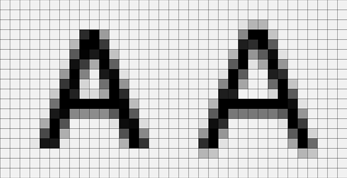 Questions of where and how a printing language lived whether it was part of an operating system or part of applications or the software associated with particular printers—had market implications because every device had to be equipped with the ability to recognize a font file format if it were to render the letters accurately. Agreeing on a single standard for type formats, Microsoft and Apple collaborated on TrueType in the early 1990s.
Fonts were sold as files, their screen, printer, and display elements packaged on disks and shipped. The size of font files was large; they took up lots of space in the hard drive. And changing fonts too many times in a single document could clog the output pipeline as a poor printer chugged away like a dancer required to change from tango to waltz and square dance moves at every step. On-screen display posed its own challenges. Counterintuitive though it may seem, in grayscale displays, blurring the font’s appearance through a process called antialiasing 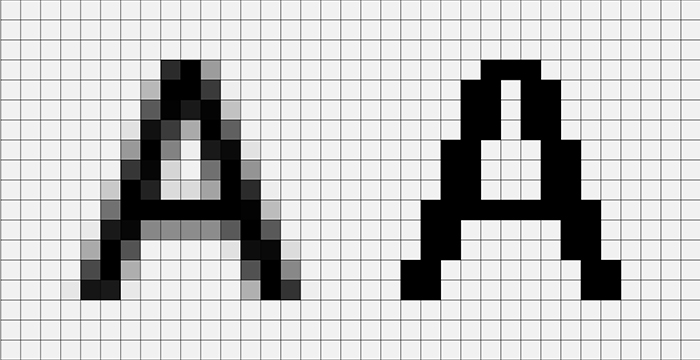 took advantage of the eye’s ability to create a sharper appearance.55 “Font rasterization,” Wikipedia, http://b-o.fr/rasterization [Editor’s Note] Up close, antialiasing looks fuzzy, out of focus, and ill-defined, but from a reading distance, the letters look finer than in the high-contrast resolution of most screens. […] These are technical problems, however, challenges for engineers and designers, not philosophers. […] Font designers speak of “character drift” when they talk about hinting, noting that the specific features that give a particular letterform its identity are at risk, losing their defining boundaries in the process. How long before the well-defined lowercase r looks like an i whose point has slipped? What is a letter in these conditions? Where is its identity held? And how is that identity specified? […]
Web-safe fonts are linked to the capacities of browsers to access font information stored in the operating system. Font files had to be loaded, rasterized, autohinted, and configured by the browser, translating a webpage’s information using locally stored fonts and display capacity. If an unfamiliar font was referenced in an HTML file, a browser would use a default font in the desktop operating system. At first, HTML [1993] had no capacity to embed fonts. Fonts were controlled by the browser. Each browser had its own limitations and specifications. Designers were appalled. HTML, designed for “display,” had stripped out one of the fundamental elements of all graphic design—font design. The crudeness of HTML’s <H1>, <H2> system—simply regulating relative sizes of the handful of fonts available for webpages—was extremely reductive but very powerful. By ignoring the information required for font description, HTML could concentrate on other aspects of display in the early days of low bandwidth and still primitive browser capability. For designers, this was the equivalent of forcing a world-class concert pianist to perform Rachmaninoff on a child’s toy piano with a dozen dull keys. By 1995, Netscape introduced a <font> tag that allowed a designer to specify that a particular font was to be used in a web display, but this required that the viewer have that exact font installed. Again, a series of default decisions could revert to the system fonts if that font were not present.
Early cascading style sheets (CSS) [1996] provided the means of specifying qualities or characteristics of fonts to be displayed. They allowed for five parameters to be indicated: family (sans serif, serif, monospace, cursive, fantasy), style, variant, weight, and size. […] The nuances of design were rendered moot through the need to invoke generic, rather than specific, fonts. […] Designers, already annoyed at the nonspecific crudeness of HTML code, had more to complain about as they watched their Gill Sans turn into Arial and Hoefler Text or Mrs. Eaves rendered as Times New Roman.
The most recent attempt to resolve these issues, Web Open File Format [WOFF, 2012], shifts font storage responsibility to a server from which the information can be called. […] The notion of WOFF depends on a continuous connection to the [Internet] so that any instance of that font will be rendered from files provided on a call. The complexity of the files—suited to a variety of browsers, screens, displays, and output devices, including printers—comes from the need to coordinate the consistent identity of the font across each stage of its design, storage, transfer, processing, restorage in memory, display, output, and so forth. The notion of distributed materiality, developed by Jean-François Blanchette,66 Jean-François Blanchette, “A Material History of Bits,” Journal of the American Association for Information Science and Technology, 62(6), 2011, 1042–57.
provides a useful description of these interdependent relations of memory, processing, storage, networks, and other features of the computational apparatus brought into play when a letter’s existence is distributed and contingent.
A letter? Imagine the lines of code, contingencies, forks, and options built into each glyph’s back story and front end. The skill of the punch-cutter, so inspiring for its manual precision and optically exquisite execution, is now matched by an equally remarkable but almost invisible (code can be read, after all, but is rarely displayed in public view) set of instructions that also encodes ownership, proprietary information, the track and trace of the foundry source, and, ultimately, perhaps, a set of signals to trigger micropayments for use. The model of the letter is now an economic and distribution model as well as a graphical form with identifying characteristics. The letter performs across its roles and activities, with responsibility at every stage to conform to standards and protocols it encounters in every area of the Web, to live on a server without becoming corrupted or decayed, to enact its formal execution on command no matter who or what has called it into play. These are megafiles with meta-elements, wrapped with instructions for behaviors as well as form. For the font storage in our times reinforces the performative dimensions of identity, of a file that is a host of latencies awaiting instantiation.77 Johanna Drucker, “From Entity to Event: From Literal Mechanistic Materiality to Probabilistic Materiality,” Parallax, 15(4), 2009, 7–17. […]
If a letter is an entity that can be specified to a high degree and yet remain implementation independent, what does that mean?88 Mason Glaves, “The Impending ’Implementation Independent’ Interface,” 2006, http://b-o.fr/glaves The term implementation independent recalls another moment, some years ago, when a young scholar of modern poetry interested in typographic specificity in editions of various works asked me, “Does a letter have a body? Need a body?” I had never pondered the question in quite that way. Where to look for an answer to this metaphysics of form? In the essay where he speculated on the origins of geometry, [philosopher] Edmund Husserl provided a highly nuanced discussion of the relation between the “first geometer” and the ideal triangles and other geometric forms whose existence he brings us to consider as independent of human apperception and yet fundamentally created within the constitutive systems of representational thought.99 Edmund Husserl, The Origin of Geometry, (Lincoln: University of Nebraska Press, 1989). But letters are not like triangles. Their proportions and harmonies are neither transcendent nor perfect in a way that can be expressed in abstract formulae. Between the opening gambit of the question of embodiment and the recognition of the fundamental distinction between mathematically prescribable forms that conform to universal equations that hold true in all instances lies the path from A to screen. For if all circles may be created through the same rules with respect to center point, radius, and circumference, letters cannot be so prescribed. In fact, the very notion of pre-scription, of a writing in advance, has philosophical resonance.
Approaching this as a practical problem brought metaphysics into play through the work of Donald Knuth in the late 1970s.1010 Donald Knuth, Metafont: the Program, (Reading, MA.: Addison-Wesley, 1986). The mathematician and computer-programming pioneer had sought the algorithmic identity of letters. And in the course of failing to find them, he provided revealing insight into the complexity of their graphical forms. Frustrated by the publication costs involved in theproduction of his books, Knuth wanted to use computer-generated type to set his mathematical texts. By 1982, he had come up with the idea of a metafont to take advantage of the capabilities of digital Media to generate visual letterforms and equations. At the core of the typesetting and layout programs he designed, TeX and METAFONT, was a proposition that a single set of algorithms could describe basic alphabetic letters. As Douglas Hofstadter later commented, Knuth held out a “tantalizing prospect…: that with the arrival of computers, we can now approach the vision of a unification of all typefaces”.1111 Douglas Hofstadter, “Metafont, Meta-mathematics, and Metaphysics,” 1985, Metamagical Themas, (New York: Viking), 266. […]
Knuth’s concept of letters had everything to do with the technology in which he was imaging their production. The idea of treating letters as pure mathematical information had suggested that they were reducible to algorithmic conditions outside of instantiation. He had believed that the letters did not need a body. Clearly the technology of production and the frameworks of conception both contribute to our sense of what a letter is. The technology of digital media could not produce a genuine metafont, but in the context of computational typesetting and design, such an idea seemed feasible. This example undercuts any technodeterminist view of letter design or conception. The limit of what a letter can be is always a product of the exchange between material and ideational possibilities. […]
Hyperrationalization of letterforms is not exclusive to the realm of digital technology. Approaches to the drawing of letters in elaborate systems has several notable precedents. Renaissance designers Giambattista Palatino, Giovanni Tagliente, and Fra Luca de Pacioli, imagining a debt to the classical forms of Roman majuscules, strove not merely to imitate the perfection of shape and proportion they could see in the giant inscriptions of the Forum but to conjure a system that could embody principles for their design.1212 Stanley Morison, Fra Luca de Pacioli, (New York: Grolier Club, 1933). 1313 Bruce Rogers, Paragraphs on Printing, (New York: Dover Reprint, 1979). The letters on Trajan’s Column, erected in A.D. 113, provided (and provide, for these aspirations continue well into the twenty-first century) the stand-out example of Roman type design. The letterforms in the inscription seem to express order and beauty in balance, a kind of majesty that was at once imperial in its strength and classical in its humanity. The myth of compass and straight-edge as the tools for their production persisted until the twentieth century, when Father Edward Catich’s close observation1414 Edward M. Catich, The Origin of the Serif: Brush Writing and Roman Letters, (Davenport: Catfish Press, 1968). showed that the quirks of form are too subtle to be traced to mechanistic instruments.1515 James Clough, “James Clough’s Roman Letter,” 2011, http://b-o.fr/clough […]
According to the Encyclopaedia Romana, Catich “hypothesized that the forms first were sketched using a flat square-tipped brush, using only three or four quick strokes to form each letter, the characteristic variations in line thickness formed by the changing cant of the brush. The letters then were cut in the stone by the same person (and not, Catich contended, separately by scribe and stone mason), the illusion of form being created by shadow.”1616 “Trajan’s Column,” http://b-o.fr/trajane […]
But when Renaissance artists looked to their antique past, they made every effort to create perfect forms. Their worldview, figured in ideal shapes as an expression of cosmological belief in the perfection of divine proportions and design, depended on regular circles and squares. The aforementioned Pacioli’s De Divina Proportione (1509) bears some of the same conspicuous graphic features as the diagrams of Tycho Brahe in his explanations of the apparent motion of the planets. As an expression of a divine design, these must comprise perfect forms, and the circles within circles elaborately constructed by Brahe to describe elliptical motions are as mistaken in their mathematical principles as are Pacioli’s attempts to redraw Roman letters by the same means.1717 Arthur Koestler, The Sleepwalkers, (New York: Grosset and Dunlap, 1959).
Other extreme approaches to rationalized design include the elaborate calculations produced at the very end of the seventeenth century by order of the French King Louis XIV. The resulting Roman du Roi, 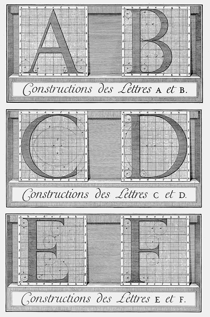 on its grid of perfect squares sanctioned by a large committee of experts, proved equally sterile, static to the eye. Modified by the punch-cutter Philippe Grandjean, the designs of the monarch’s font, held by exclusive license for his use, were modified to subtle effect in the production process. Matter triumphed over idea, and the hand and body over intellection, as the experienced type designer recast the ideal forms into realized designs that passed as perfect. […]
In fact, every technology suggests possibilities for letterform designs: clay and stylus, brush and ink, drawing pens and vellum, metal type, steel engravings, paper and pencil, ballpoint, photography and photomechanical devices, digital type. But letter design is not simply determined by technology. Gutenberg’s metal characters took their design from preexisting handwritten models just as surely as photocomposition copied the design of hot metal fonts—despite the unsuitability of these models to the new media. Finding a vocabulary for a new technology takes time. The esthetics of a medium in any way self-evident—or immediately apparent. How was the metal-ness of metal to be made use of with respect to the design of letterforms?1818 Daniel Berkely Updike, Printing Types: Their History and Use, (Cambridge, MA.: Harvard University Press, 1922). The inherent esthetics of phototype and its ability to carry decorative and pictorial images, drawn and fanciful forms; to be set so close the letters overlap; or to be produced with a bent and curved film strip through which light shining made an anamorphic or distorted form ;all this had to be discovered.1919 On the notion of “discovery,” see Pierre-Damien Huyghe, “Getting Technology to Take a Step Forward,” an interview with Anthony Masure, translated from the French by Simon Pleasance and Fronza Wood (Paris: B42/Fork, Back Office, 1, 2017), 76–84, http://b-o.fr/huyghe [Editor’s Note]. Similarly, in the simulacral technologies of digital media, where shape-shifting and morphing are the common currency of image exchange, what defines the technological basis of an esthetic—the capacity for endless invention and mimicry or the ability to create a randomization in the processing that always produces a new alteration in each instantiation?
But conceptual shifts across historical moments and geographies arise from other impulses than technological change, and this is crucial. The conception of forms can be realigned radically when explanatory narratives change. […] A letter, like any other cultural artifact, is designed according to the parameters on which it can be conceived. If we imagine, for instance, that a letterform may be shaped to contain an image with a moral tale, or that the letters of the alphabet comprise cosmological elements, or national histories, then designs that realize these principles may be forthcoming no matter what the material. Similarly, a twentieth-century modern sensibility inclined to seek forms within the esthetic potential of materials of production was satisfied by designs that brought forth the qualities of smoothly machined curves such as those typical of Deco forms. Obviously, in any historical moment, competing sensibilities and conceptualizations exist simultaneously. The modernity of Paul Rand exists side by side with the pop sensibility of Milton Glaser and the 1960s psychedelic baroque style of poster designer Victor Moscoso.2020 Steven Heller and Seymour Chwast, Graphic Style: From Victorian to Digital, (New York: Harry N. Abrams, 2000). Can anything be said to unify their sensibilities? At the conceptual level, yes—a conviction that custom design and innovation are affordances permitted, even encouraged, in an era of explosive consumer culture. Thus, for our moment, the need to use the discrete properties of the alphanumeric code allows us to press its arbitrary signs into the service of a World Wide Web whose Western roots thus connect it to antiquity.
The design of optical character recognition (OCR) systems divides along conceptually familiar lines.  Print materials are analyzed by imagining their characters as pictures, distinguished one from another by graphical features. By contrast, handwriting samples are studied by capturing the sequence of events in their production. OCR was already dreamed of by the visionary entrepreneurial inventors of the mid- to late nineteenth century, who hoped they might create a machine capable of reading to the blind. Not until the mid-twentieth century was the first actual “reading machine” produced. The technological capacity for reliable machine reading progressed according to various constraints. Initially fonts were designed to suit the capacities of machine reading, with a feature set that occupied distinct areas of a grid. This allowed a unique, unambiguous identity to be ascribed to each letter through a scanning process, without the need for sophisticated feature extraction or analysis (the font was essentially a code, though it could be read by humans as well as machines). Technological capacities have become more sophisticated and no longer require use of a specially designed font, but some of the processes of pattern recognition in these earliest systems are still present. These basic techniques rely on thresholding (sorting characters from background), segmentation (into discrete symbols), zoning (dividing an imaginary rectangle enclosing the letter so that points, crossings, line segments, intersections, and other elements can be analyzed optically), and feature extraction and matching (against templates or feature sets). Problems occur when letters are fragmented, much visual noise is present, or letters overlap or touch other elements in the text or image. The feature extraction can be complemented with natural language processing, gauging the probability of the presence of a word according to statistical norms of use, frequency, or rules of syntax. In handwritten specimens, the basic act of segmentation poses a daunting challenge, and therefore the automated reading of handwriting is most effective when working with samples that store the production history of strokes or the act of a letter’s coming into being. Thus the two approaches to OCR align with earlier conceptions of the letter ;as either an image with distinctive features or as the result of a series of motions resulting in strokes. […]
In overview, we can say that a letterform may be understood graphically as a preexisting shape or model, a ductal form created by a sequence of strokes with varying pressures, an arbitrary sign, an image fraught and resonant with history and reference, an arrangement of vectors or pixels on a screen, or a digital file capable of being manipulated as an image or algorithm. Conversely, in conceptual terms, we understand a letter as a function of its origins (born in flames, traced on wet sand, marked by the hand of God on tablets of stone, reduced from images, invented out of thin air, scratched in rocks), its value (numerical, graphical, pictorial), its form (style, history, design), its functionality (phonetic accuracy, legibility), its authenticity (accuracy), or its behaviors (how it works). Other conceptualizations might be added to this list.
Therefore asking “what is a letter?” is not the same as asking “how is it made?” The answers are never in synch—the questions do not arise from a common ground— but they push against each other in a dynamic dualism. The road from invention to the present existence of letters is a dialogical road, not a material one. The milestones are not a set of dates with tags: creation of the quill pen, invention of printing, or production of the punch-cutting machine. Important as these technological developments are to the transformation of designs in physical, material form, they are modified in relation to the conceptual schema by which the letters may be conjured as forms. The letters did not migrate from A to screen. Atomistic in their operation, contingently distributed in their constitution, and embodied in their appearance, they have had to be reconstituted, remade in their new environment, still mutable after four thousand years of wandering.
Full text initially published in Comparative Textual Media, N. Katherine Hayles and Jessica Pressman (ed.), (Minneapolis: University of Minnesota Press, 2013), 71–96.