The web and print pages of major papers are full of diagrams, maps, graphics, scatter graphs and schematics. Using an intricate series of signs, colors, text, pictograms and images, the aim of these visualizations is to provide the reader with a didactic approach to information. Since the early 2000s and the development of loading data into networks (big data and open data), the press has also adopted these new methods of expressing statistics.
The Advent of the Graphics Editor
The New York Times, an iconic pioneer in journalism that consistently seeks to propose innovative editorial formats to its readers, consequently decided to explore the technical possibilities offered by the Web. This American daily hired a production team dedicated to this activity, which resulted in the creation of new professions melding interactive and graphic design, statistic analysis, journalism and web development. Generally referred to as graphics editors (or visual journalists), this new professional field requires two skills to conceive these visualizations: an editorial capacity to analyze data, combined with the ability to convert it into a specific graphic representation.
In order to address the technical requirements intrinsic to the conception of these representations for the Web, some graphics editors were at the forefront of the development of software tools for design production. Mike Bostock, among others, designed the JavaScript library D3.js.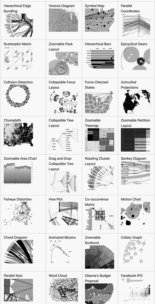 just before he began working for the New York Times. It enables the dynamic updating of an HTML page based on the data represented. Its excellent optimization makes a high level of reactivity with interactive graphics and effective management of animation possible.
Bostock’s creation of D3.js was an landmark event in this new field that gave birth to this renewed form of information visualization. Renowned statistician Edward Tufte went so far as to cite him as a key player in this domain. The variety of examples presented on D3js.org show the extent of its capacities: the zoom provides access to multiple layers of data; filters authorize the selection of subsets and the dynamic reorganization of information. The animation makes the representation of dynamic phenomena possible. These techniques of interaction and display enable the reader to access vast amounts of data.
The Pitfalls of Quantification
Naturally, the production staff at the New York Times turned these technical developments to good account. From the mid-2000s on, the paper increasingly made use of exploratory information systems that enabled the user to wade through a dizzying amount of data sets. It might however be pertinent to question the approach of these new editorial models, which was mainly quantitative and not qualitative.
In 2011, Kevin Quealy, then Graphics Editor at the New York Times, presented a selection of projects published on the paper’s website in a lecture at the Walker Art Center.11 Kevin Quealy, “The New York Times Graphics Department,” Walker Art Center, The Gradient, 2 March 2011: http://b-o.fr/quealy Among them was the article How Different Groups Spend Their Day22 Please see the Adobe Flash data visualization by Shan Carter, Amanda Cox, and Amy Schoenfeld, “How Different Groups Spend Their Day,” New York Times, 31 July 2009: http://b-o.fr/dataviz which proposed to represent the amount of time specific population groups—delineated by a dozen or so characteristics such as sex, age, professional situation or color—dedicated to a series of daily activities. Not forgetting to pat himself on the back, Quealy presented what he considered to be the key aspect of this type of visualization: the concentration of vast sets of data within a constrained format. Using a barrage of buttons, the user is invited to compare an ensemble of statistical graphics. When prompted by the cursor, a series of informational dialog boxes pop up, revealing a series of encoded bits of information that provide additional details on the study.
In fact, while the project did achieve the objectives set by Quealy, he limits himself to proposing only a quantitative reading of the data without the analysis or context that would provide one with the means of drawing a solid conclusion. Galvanized by the exploratory potential of these interactive tools at their disposal, graphics editors tend to set aside the analytical aspects one might expect from a professional newspaper article. While these methods of representation are certainly more sophisticated, they fail to offer a critical analysis of the information or to elaborate an intelligible editorial format.
Another small problem: in 2016, at the Information+33 Gregor Aisch, “Data Visualization and the News,” lecture given at Information+, Emily Carr University of Art and Design, Vancouver, 16-18 June 2016: http://b-o.fr/aisch conference, graphics editor Gregor Aisch revealed that only a mere 15% of NYT readers took the trouble to interact with these interfaces—the simple button seemed to be one step too far, representing a barrier to further consultation. Unactivated, these productions remained mute graphic objects, consequently rendering them counter-productive.
Experiments Left, Right and Center
This failure gave rise to the search for other, more engaging, interactive modes. In its series You Draw It, the Times proposed a model of an article interspersed with visual modules that forced the user to interact in order to access the analytical text. The article What Got Better or Worse During Obama’s Presidency44 Larry Buchanan, Haeyoun Park, Adam Pierce, “You Draw It: What Got Better or Worse During Obama’s Presidency,” New York Times, January 2017: http://b-o.fr/draw consequently required the reader to elaborate hypotheses on the evolution of employment rates, immigration or national spending over the course of the Obama presidency (2009–2017) by using their mouse to draw the graphics curves themselves. Then they could hit a button that reveals a paragraph of explanatory text as it compares their estimates with the actual statistics.
These constant solicitations, which made use of motivational devices from video games such as Draw Something,55 Draw Something is a mobile app that went public in 2012. Developed by Omgpop, a subsidiary of the American video game developer Zynga, this Pictionary-inspired social drawing game confronts two players, who take turns submitting drawings in order to make the other person guess a word. It is very popular and has been rated among the most downloaded apps on iOS at the App Store. transformed the analysis of information into a series of gratifying rewards under the pretext of holding the attention of the user (and moreover increasing the reader’s interaction time online, an important consideration for advertisers).
In the wake of this quest for innovation and usability (a term fashionable in both UX and UI), Aisch concluded that the widespread dissemination of smartphones and tablets introduced several constraints. For example, the reduction of screen size made adapting interfaces a perilous undertaking, and reduced their practicality for the user as well as limiting the maximum density of viewable information. Furthermore, their technical compatibility required dedicated IT development, which in turn increased the creation time of the graphics, already limited due to the periodicity of the paper itself. Taking this evolution into account, and, with a view to offering a reading experience compatible with all platforms, the NYT graphics editors then sought to concentrate their efforts on more rudimentary modes of interaction, such as scrolling and swiping, the characteristic interactive gestures when using smartphones or tablets, as well as encouraging designers to make use of webpages that deploy vertically.
The article Death in Syria66 Karen Yourish, K.K. Rebecca Lai, Derek Watkins, “Death in Syria,” New York Times, September 2015: http://b-o.fr/syria makes pertinent use of this singular property of the Web. It describes the situation of the Syrian conflict as one taps on the number of civilians killed over the course of the first eighteen months. In the introduction, each of the 200,000 civilians killed is represented by a red dot whose position is regulated by an algorithm. As the page scrolls, it reveals a progressive accumulation of these symbols, which slowly fill the screen. The graphic design of the data thus contributes to the dramatization of the information. As one follows the text, as imposed by the scrolling, the visualization of the data is integrated as a narrative device whose aim is to confront the reader with the gravity of the situation described in the article.
Back to Square One
The article What if Trump Really Does End Money for the Arts?77 Graham Bowley, “What if Trump Really Does End Money for the Arts?” New York Times, March 2017: http://b-o.fr/points also makes use of the verticality of the screen, proposing the most extreme type of representation. A long line of typographic dots (approximately 5,000) corresponds to the federal budget of the United States. This series of characters is compared to the final period of the phrase whose unicity represents the budget allocated to culture by the Trump administration :
If these dots represent federal spending, ............................................................................................................................................................................................................................................................................................................................................................................................................................................................................................................................................................................................................................................................................................................................................................................................................................................................................................................................................................................................................................................................................................................................................................................................................................................................................................................................................................................................................................................................................................................................................................................................................................................................................................................................................................................................................................................................................................................................................................................................................................................................................................................................................................................................................................................................................................................................................................................................................................................................................................................................................................................................................................................................................................................................................................................................................................................................................................................................................................................................................................................................................................................................................................................................................................................................................................................................................................................................................................................................................................................................................................................................................................................................................................................................................................................................................................................................................................................................................................................................................................................................................................................................................................................................................................................................................................................................................................................................................................................................................................................................................................................................................................................................................................................................................................................................................................................................................................................................................................................................................................................................................................................................................................................................................................................................................................................................................................................................................................................................................................................................................................................................................................................................................................................................................................................................................................................................................................................................................................................................................................................................................................................................................... then the combined budgets of the National Endowment for the Arts, National Endowment for the Humanities and the Corporation for Public Broadcasting would be the size of the period in this sentence.88 Ibid.
By integrating the graphic representation into the body of the text, the journalist demonstrates an economical use of resources, which refers to the subject of the article in a manner that does not make the reader feel the absence of a graphic editor. Even if it’s not specifically representational, this example illustrates the capacity of data visualization to lend meaning even without high-performance technical devices such as D3.js. Its simplification contributes to the creation of remarkable contemporary typographical formats that echo certain historic productions that predate the development of the digital image.