Data visualization has lately become an unlikely form of mass entertainment. When public health professor Hans Rosling first presented his giant, animated graphs of floating bubbles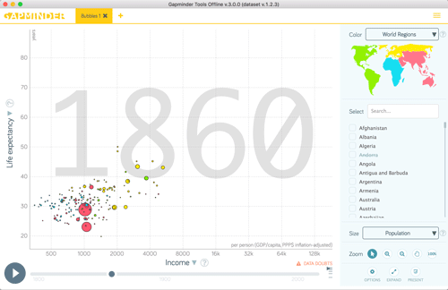 —challenging popular preconceptions about global life expectancy and family sizes—he was met with whoops and applause at the 2006 TED (Technology, Entertainment, Design) conference.11 Hans Rosling, Hans Rosling Shows the Best Stats You’ve Ever Seen (presentation at the TED Conference, February 2006): http://b-o.fr/rosling-stats The video of the presentation has since attracted 2.8 million online viewers, making it the seventh most-watched TED talk in the past five years. “The statistics of the world have not been made properly available,” argued Rosling. “Animated graphics can make a difference.”33 Hans Rosling, Hans Rosling’s New lnsights on Poverty (presentation at the TED Conference, March 2007): http://b-o.fr/rosling-poverty
Data provides the means by which science progresses, legislation changes, and society advances; data is the enemy of witch hunts, bigotry, and ignorance (not to mention Creationism). But data is always gathered at a certain time with a certain purpose; and to be useful it must be mined, parsed, and presented. Each step of this process involves decisions about what to omit and what to prioritize. Yet the end result, the visualization, carries an authority, timelessness, and objectivity that belies its origins. Curiously, this fact is neglected in the otherwise rich discourse around data visualization and information design. [Visual studies researcher] Johanna Drucker has observed that information designers almost entirely ignore what she considered theoretical problems:
An empiricist assumption that what you see is what is there underpins their practice. The self-evident character of graphic entities—lines, marks, colors, shapes— is never itself brought into question, however much the parameters on which they are generated or labeled might be criticized. That images themselves might be dialectical, produced as artifacts of exchange and emergence, is an idea foreign to the fields of engineering and information design.44 Johanna Drucker, SpecLab: Digital Aesthetics and Projects in Speculative Computing (Chicago: University of Chicago Press, 2009), 73.
Scientific Practice
To explore why the critical discourse of the arts and humanities is conspicuously lacking around visualization requires that we take a meta-view of the contexts in which it is practiced. Visualization might be separated into three categories of practice. The first, and most dominant, is scientific. This, the domain of laboratories, supercomputers, and vast monitor arrays, enjoys the funding of the military industrial complex and a sense of societal importance. According to historian Alfred Crosby, “visualization is one of only two factors responsible for the explosive development of all modern science.”55 Linton Freeman, “Visualizing Social Networks,” Journal of Social Structure, 1 (2000), http://b-o.fr/freeman Computer scientist Toby Segaran argues that “almost every field is becoming more reliant on data analysis for advancement.”66 Toby Segaran and Jeff Hammerbacher, Beautiful Data: The Stories Behind Elegant Data Solutions (Sebastopol, CA: O’Reilly Media, 2009), 348. Examples in the scientific category would include visualizations of galaxy formation, predicted weather and oil spill patterns, and simulations of electron behavior. Typically deploying the terms “data” or “information visualization,” scientific visualization fashions itself as a tool of discovery improved through scientific method. The implicit assumption is that the tool allows us to explore the data, without bias. Adopting industries are described by one classic textbook in the field as those driven by continuous innovation and repeated discovery: “pharmaceutical drug research, oil-gas exploration, financial analysis and manufacturing quality control.”88 Benjamin B. Bederson and Ben Shneiderman, The Craft of Information Visualization: Readings and Reflections (Burlington, MA: Elsevier, 2003), xix.
To engage in the scientific discourse around visualization requires familiarity with—if not higher degrees in—mathematics, statistics, computer science, and cognitive psychology. But even the most cursory glance at the literature reveals a positivist discourse driving questions of visual form, grounded in principles of human cognition. ls the visualization appropriate for the data? How does the visualization fare in terms of usability issues? How does the (universal) human brain respond to visualization x as opposed to visualization y?99 See the work of Jarke Van Wijk, Colin Ware, Ben Shneiderman, and Stuart Card.
Journalistic Practice
The second category is journalistic. A response to the information tsunami, and driven by a moral or commercial obligation to inform or entertain, projects in this category strive to make data visible and accessible. Whereas the scientific category is characterized by large data sets and various means of discovering new patterns, the journalistic category seeks to simplify and explain those data sets. As New York Times Graphics Director Steve Duenes put it: “lt is our job to edit, condense and reduce.”1010 Gestalten.tv, All the News That’s Fit to Post (documentary video podcast about the New York Times Graphics Department): http://b-o.fr/gestalten Traditionally the domain of information designers whose task is to scrape, shape, and frame existing data, rather than mine and parse new data, this category has lately shifted from static forms to quite advanced interactive web-based formats that allow the public to explore data for themselves. The New York Times Graphics Department provides paradigmatic examples of journalistic information design, as made evident in its fast turnaround of maps and graphics illustrating the hurricanes, tsunamis, oil spills, and wars of the past decade. Freelance journalist and designer David McCandless, meanwhile, develops visualizations that provide a meta-layer of commentary on other visualizations, such as his “billion dollar o-gram,” which seeks to put military expenditure, oil revenue, foreign aid, and charitable donations in context through comparison.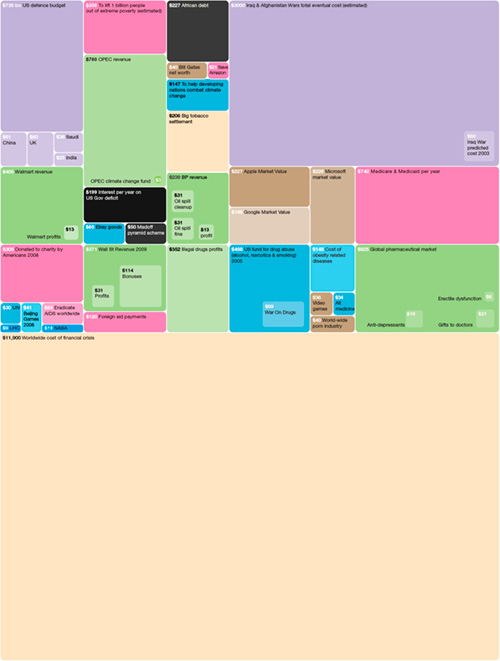 His revelation, after mining and visualizing Facebook data, that more couples split up around spring break and Christmas than other times of the year, might be described as journalistic entertainment visualization.
Rosling’s Gapminder [2006] software for animating global health data began as an educational tool (to make university students use and understand statistics to acquire a “fact-based” world view), but is ultimately a journalistic means to inform and transform public opinion. “Visualization and animation services that unveil the beauty of statistics for wide user groups may induce a paradigm shift from dissemination to access,” Rosling has argued. “Data provided in animation format is well suited to tell stories using television and webcasts.”1111 Hans Rosling, “Visual Technology Unveils the Beauty of Statistics and Swaps Policy from Dissemination to Access,” Statistical Journal of the IAOS, 24, 2007, 103–104. Martin Wattenberg’s search tool uses simple computation methods to find repetition in texts, which are represented as 3D “skyscrapers” over the text body. Teaming up with journalist Chase Davis, Wattenberg set Chimera to work to find “clone laws”—legislation prewritten for elected officials by corporations or partisan groups. They found, for instance, that a law passed in Minnesota matched a law passed in Alaska exempting firearms made and sold in-state from federal regulations— “not exactly word for word but many, many passages,” noted Wattenberg.1212 Martin Wattenberg, “Numbers, Words and Colors” (presentation at the MIT HyperStudio Humanities + Digital Visual lnterpretation conference, Cambridge, MA, May 20, 2010): http://b-o.fr/wattenberg Googling the most distinctive passages led to a website promoting the Firearms Freedom Act, a chilling reminder that the laws of this country are not written by legislators but by special interest groups. Discussion of formal issues in this category tends to be dominated by the standards codified by authorities such as Edward Tufte, Donald Norman, and Ben Shneiderman. Examples will be familiar to any designer: static information graphics should aspire to transparency, objectivity, and an absence of “chartjunk” (Tufte), and interactive visualization should aspire to visual consistency, informative feedback, a sense that the user is in control, and simple error handling (Shneiderman).1313 Ben Shneiderman, Designing the User Interface: Strategies for Effective Human-Computer Interaction (Boston: Addison-Wesley, 2010).
Artistic Practice
The third category is artistic. Generally misunderstood by the scientific community as cosmetic or frivolous, the art of visualization nevertheless has an important cultural role, reinforced by historical precedent. Artistic visualization, much like thousands of years of art before it, reflects on cultural conditions. lts specific subject is our current preoccupation with data, a development of what critic Benjamin Buchloh called the “aesthetics of administration” that concerned the conceptual artists of the postwar years: “the operating logic of late capitalism and its positivistic instrumentality.”1414 Quoted in Warren Sack, “The Aesthetics of Information Visualization,” in Context Providers: Conditions of Meaning in Media Arts, Margo Lovejoy, Christiane Paul, and Victoria Vesna ed. (Bristol, UK: Intellect ltd., 2011). Artistic visualization’s role is to bring to light and challenge the prevailing assumptions behind the rhetoric, and to offer new, alternative modes of representation. lt is the only category of the three in which form, line, and color are not evaluated solely in terms of usability issues.
Absence of Critique
Examples of visualizations from all three categories can be found on popular blogs such as Information Aesthetics (infosthetics.com; started by data visualization and architecture professor Andrew Vande Moere in 2004) and Visual Complexity (VisualComplexity.com; started by user experience designer Manuel Lima in 2005). Both sites are cheerleaders of the dazzling and richly diverse array of visualizations produced by professionals and amateurs these days, but neither carries the kind of critical discussion called for by Drucker, the “who made it, for whom, and for what purpose ;ideology 101.”1515 Johanna Drucker, “Humanistic Approaches the the Graphical Expression of lnterpretation” (presentation at the MIT HyperStudio Humanities + Digital Visual lnterpretation conference, Cambridge, MA, May 20, 2010): http://b-o.fr/drucker lt is difficult not to see the reductivism in many of the visualizations rendering human communication as a thousand dots and veins of wispy color on black backgrounds, as if messy life had finally been conquered, sorted and re-arrayed as exquisite form.
lntricate flowerlike arrangements of frequently used terms in the New York Times by Jer Thorp, for example, were the first in a series of projects made by the digital artist for the newspaper’s research and development lab. The question “for what purpose?” is initially difficult to answer, since zoomable interfaces of thousands of word constellations don’t immediately suggest incisive analysis. Thorp’s more recent Cascade project for the Times’ R&D group, however, which tracks readers’ tweets and online sharing habits with colored squares linked by thin gray lines shown through multiple alternative views, reveals a clear agenda in a promotional video. “Perhaps most importantly,” asks the voice-over, “how can the Times use this information to expand its impact in the conversation, to maintain its position as a news and information leader?” The visualization, arguably, is less a research inquiry into the nature of information sharing than the territorial surveillance of a media battlefield.
Other projects illustrate how the formal languages of experimental artistic visualizations are quickly absorbed and putto work for commercial purposes. Student Cooper Smith’s recent visualization of Manhattan running routes registered by 1,000 runners using the Nike Plus online synchronization service recalls the earlier, 2002 experimental project by Esther Polak to render a “live” map of Amsterdam by equipping sixty residents with GPS tracer units hooked up to a central server. Where Polak sought to describe the city as it is experienced by its residents, drawing from the anti-rationalist legacy of postwar psychogeography, Smith’s well-intentioned aggregation reinforces a collusion of corporate (Nike) and military (GPS) interests: running is no longer just running, but measured, collated, and compared, tagged with personal targets and simulated rewards.
Critical Cartography
The lack of critical discourse around visualization seems all the more glaring given the critical toolkit applied to maps and cartography, which blossomed during the postwar years. An exhibition at the British Library and associated television series on the history of cartography delved into this rich vein of scholarship in 2010.1616 Peter Barber and Tom Harper, eds., Magnificent Maps: Power, Propaganda and Art (London: British library, 2010). See also BBC Four, “The Beauty of Maps: Seeing the Art in Cartography” (2010): http://b-o.fr/bbc Behind the history of the map is what [the geographer] Jeremy Crampton describes as a “whole series of engagements in politics, propaganda, crime and public health, imperialist boundary-making, community activism, the nation-state, cyberspace and the Internet. That is, mapping has a politics.”1717 Jeremy Crampton, Mapping: A Critical Introduction to Cartography and GIS (New York: John Wiley & Son, 2010), 9. That thematic maps—the precursors of infoviz—and statistics emerged in the early nineteenth century as “technologies of management” is no coincidence. Political systems, legislation, and the core of our cultural values are all integrated with these technologies. Rather than simply describe a preexisting world, these technologies, in their methods of framing, selecting, and predicting, make up a world.1818 Ibid.
The cartographic scholar J.B. Harley famously noted that the key to decoding a map was to look for its “silences”—maps “exert a social influence through their omissions as much as by the features they depict and emphasize.”1919 John B. Harley, “Maps, Knowledge and Power,” in The New Nature of Maps: Essays in the History of Cartography, Paul Laxton ed., (Baltimore: John Hopkins University Press, 2001), 67. ln the same way, today’s network maps and maps of Internet activity reveal their territorial imperatives through what is left out. Maps of the Internet coming from computer research labs in the late 1990s, for example, were frequently shown with a blank backdrop as if to suggest that the network were somehow detached from real space, perhaps adrift in a vast terra incognita of potential security breaches or, alternately, lands yet to be wired. A diagram of “subject matter experts,” produced by management consultant and network analyst Valdis Krebs in 2008, is meant to help us identify the fragile nodes in a company’s knowledge domain. lt depicts people as colored boxes connected by lines: they are connected if one goes to the other for expertise or advice, and those with many arrows pointing to them are sought out often for assistance. The nodes are colored by their potential to leave/exit the organization. Conspicuously “silent” in the diagram are assumptions about the rate of transfer of knowledge around a network and the working atmosphere. Obviously, a work environment in which people share knowledge freely in pursuit of a shared goal will lessen the impact of a key figure (the “border router”) departing the network, compared with an environment in which long-entrenched employees harbor their knowledge as a form of power. The missing information from Krebs’ map may ultimately provide the key to the functioning of the network, to the extent that a map of the mood of the network may be more useful.2121 Valdis Krebs, Finding Go-To People and Subject Matter Experts [SME] (2008): http://b-o.fr/krebs
An alternative artistic network map brings such absences to light. Artist Uta Eisenreich’s Teamwork Sociogram,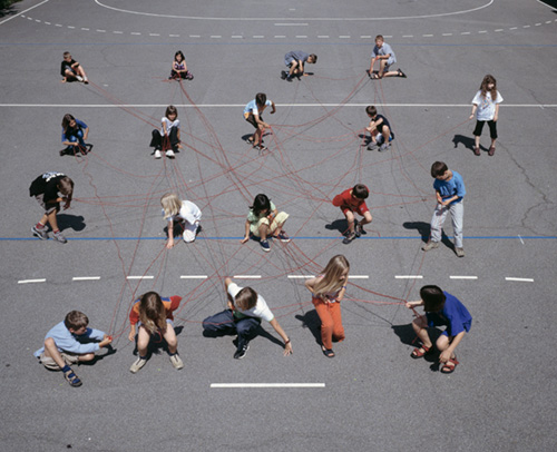 produced with children at Langmatt School in Zürich, takes the form of a series of photographs of the children in the schoolyard, linked to each other by pieces of colored string. Red strings, for example, were linked by the students in response to the question: If you were allowed to invite three classmates to your birthday party, who would they be? The effect of the photography series is to reveal not the breadth or security of a network, but its fragility; to remind us that the nodes on a network diagram are not uniform squares but people; to hint that, in analyzing a network, it is the node that knows how it is connected. The project references the content of the 1930s social network maps of psychiatrist Jacob Moreno,
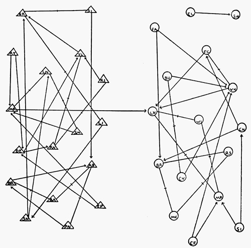 which sought to identify the structure of groups based on affections rather than roles.2222 Freeman, op. cit. But whereas Moreno’s and Krebs’ diagrams are highly abstracted nodes and lines, Eisenreich’s network map is photography, connoting the ephemeral nature of social ties, and indeed, network maps.
Recent scholarship has demonstrated that our conventions for representing the passage of time are inextricably tangled with a post-18th-century view of time as a sequential line.”2323 Daniel Rosenberg and Anthony Grafton, Cartographies of Time: A History of the Timeline (New York: Princeton Architectural Press, 2010). Temporality is a big problem for the network map; the authority of the line-and-node diagram implicitly suggests that the network depicted is fixed in time. As one group of sociologists has noted: “Most network images do a poor job of representing change in networks, and researchers make do by presenting successive snapshots of the network over time… The problem is fundamental to the media. To effectively display the relational structure of a social network, at least two dimensions are needed to represent proximity, and that leaves no effective space (on a printed page) to represent time.2424 James Moody, Daniel A. McFarland, and Skye Bender-DeMoll, “Dynamic Network Visualization: Methods for Meaning with Longitudinal Network Movies,” American Journal of Sociology, 110, 2005, 1206–1241.
The problem might seem to be solvable with the help of interactive or animated visualizations that show the ebbs and flows of a network. This is to miss the point, however, that every visualization, be it a fixed frame or selected frames from a given period, is a construction of time produced from a particular viewpoint. Drucker and [digital humanities researcher] Bethany Nowviskie’s explorations with students at the University of Virginia’s Speclab include experiments at representing time as experiential rather than “unidirectional, homogenous, continuous—none of those things are true in humanistic experience.”2525 Drucker, op. cit. Europe is mapped according to the difficulty of getting from place to place, a train journey is mapped according to perceived time between stations, and days are mapped according to heavy events and levels of anxiety. The goal is to achieve an “affective” mode of representation, and in so doing, “question fundamental assumptions about how we know what we know.”
Situated Visualization
ln summary, the critical function of artistic visualization is to call into question the claims of transparency, certainty, and objectivity embedded in the Cartesian language of the genre. lt is to insist on the situatedness of the observer and the phenomenon being observed. Projects as seemingly innocuous as Nicholas Feltron’s “personal annual reports,” 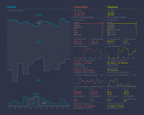 named for an imaginary organization named Feltron, work at this level by impeccably parodying the visual and textual language of the corporate annual report—while conveying elements of the modern-day lifestreamer’s narcissism. The 2005 Feltron report quantifies in statistical charts everything from kinds of meals eaten, photographs taken per country visit, and the amount of time spent at work and play by its author.
When the situatedness of a visualization is reinforced, it can be scrutinized as a work of rhetoric, a “matter of concern” rather than a “matter of tact.”2727 Bruno Latour, “A Cautious Prometheus? A Few Steps Toward a Philosophy of Design (with Special Attention to Peter Sloterdijk),” presentation at the Networks of Design meeting of the Design History Society, Falmouth, Cornwall, UK, September 3, 2008: http://b-o.fr/latour The “scribing” visualizations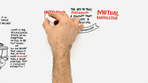 of UK-based group Cognitive Media do exactly this by eschewing the tenets of Tufte to achieve a subjective visual means of annotating ideas as they emerge in conference presentations and workshops. Cognitive Media’s charming, intriguing marker pen-on-whiteboard drawings, notably of scholars Jeremy Rifkin and Philip Zimbardo, draw attention to a rhetorical aspect of the public presentation that has suffered considerably in the PowerPoint [1990] age: that the persuasiveness of a presentation is due not entirely to its logical strength, but also to its emotional appeal and the character of the speaker in classical terms, not only its logos but its pathos and ethos. If Cognitive Media’s informative and visually rich graphics do convey a rich and situated representation of the information as delivered by a particular speaker, then are they not a better paradigm than, say, a flow chart, geometric mind map, rectilinear graph, or table versions of the same information?
Situatedness and contingency are certainly not alien to the language of visualization. Arguably, the sheer fecundity of the field is beginning to shift the ground away from the fixed, objective, atemporal, and totalized visual rhetoric. ln visualizing the extensive changes made to Darwin’s Origin of Species during the course of its publication through six editions, for example, Ben Fry unsettles the idea that scientific notions appear as fixed ideas. 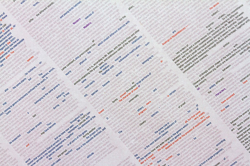 ln visualizing the changes to specific entries in Wikipedia,
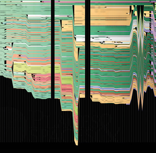 Wattenberg and Fernanda Viégas zoom in on the disputes and controversies that surround topics that might otherwise seem long since settled. An encyclopedia page becomes a contested territory.
The unaddressed question so far in this discussion is the role of graphic designers in this vast, flourishing field. Clearly designers are at work in all three categories of visualization outlined above, but in increasingly collaborative environments. Traditionally, the designer might produce static graphics, or come in to clean up dynamic visualizations once the hard-core statistical, analytical work and programming were complete. But increasingly, there are designers with programming skills and mathematicians with design skills making inroads into each other’s professions. The web-enabled availability of data sources, notably from governments and nongovernmental organizations aspiring to transparency, and the proliferation of free visualization tools and forums—from Many Eyes (visualization platform spawned at IBM) to Gephi (a Paris-based open source consortium)—has brought a host of practitioners to the field, designers among them.3131 Gephi Consortium (founded October 2010): http://b-o.fr/gephi
Visualization depends increasingly on a cadre of interdisciplinary skills. Fry, codeveloper of the ubiquitous Processing [2001] open source programming environment, recently argued at a conference that the typical process of scientists throwing the parsed, filtered, mined data “over the wall” to the graphic and interaction designers is “a terrible way of doing things.” As a designer capable of building dynamic visualizations and participating at the data-mining and parsing stage, Fry finds that “the way the interaction works is going to affect how you do the data-mining portion. You can’t really separate these things.”3232 Ben Fry, “Computational Information Design,” (presentation at Adaptative Path UX Week Conference, August 24–27, 2010): http://b-o.fr/fry2
At MIT’s Humanities + Digital Visual lnterpretations conference in 2010, Wattenberg, a trained mathematician who codeveloped the Many Eyes visualization platform at IBM, argued that the visualization explosion has had a curious effect on visual literacy. lt now takes two forms, he argued: reading and creating. Reading is “not in bad shape,” he claimed, but knowing whether a line chart, pie chart, or a bar chart is the suitable form for the visualization you are trying to make requires a certain amount of expertise. “One of the things I’m hoping is that people can teach each other, that was one of the hopes for Many Eyes.”
Visual literacy, however, is not the only skill required for navigating the deluge of data. The list of facets underemphasized or ignored in the dominant language of visualization is long enough to present a worthy challenge to any research group. The perplexing part is that while the art and critical design world has been riffing off the yawning gaps in the infoviz view of existence, the mainstream practice continues to deploy a visual rhetoric that treats data as pure and judges questions of visual form only in terms of a universalist idea of usability. This seems all the more curious when one considers that the art of typography has long since passed through the perceived crisis that clarity of communication would be lost with the loss of the appearance of objectivity.
For visualization to fully mature requires a better cross-fertilization between the three contexts of visualization practice. The journalistic practice of making data accessible and legible has much to teach the sciences; the forms and critiques of artistic practices can inform, question, and reinvigorate the scientific and journalistic ends of the spectrum; and scientific visualization can provide the journalistic and artistic practices some fundamental lessons in rigor.
This essay was first published in the catalog Graphic Design: Now in Production, Cooper-Hewitt National Design Museum/Walker Art Center, 2011. Thank you to Peter Hall for permission to reproduce this article.