A pioneer and key figure in interaction design in France, Étienne Mineur is a graphic designer whose work transcends technical periods, from the first interactive terminals to “augmented” books, by way of CD-ROMs, websites and mobile applications. Back Office looks back over his unique career, which provides insight into the contemporary scene.
I entered the École des Arts Décoratifs in Paris in 1987; I was in the Visual Communication section, studying with Jean Widmer and Rudi Meyer. This school was really paradoxical: there were no courses on the use of computers, but there was already an open computer room, which was always deserted, where you could work with large Silicon Graphics machines, or a Macintosh Plus (1986). Unlike the other students, I was already familiar with personal computers, since there was a Commodore 64 at my parents’ house, and sometimes, my father brought home an Apple Lisa on weekends to work. At the time, my Commodore 64 had no mouse, no graphical user interface, just text. 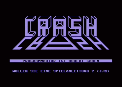
I made use of the Arts Décoratifs computers to discover QuarkXPress (1987), and PageMaker (1985). I had fun with their graphic interfaces, with their “windows.” I didn’t need any of this for my classes, it was more just for fun when I was hanging out with my friends.
I developed an interest in programming when MacroMind VideoWorks (1985) 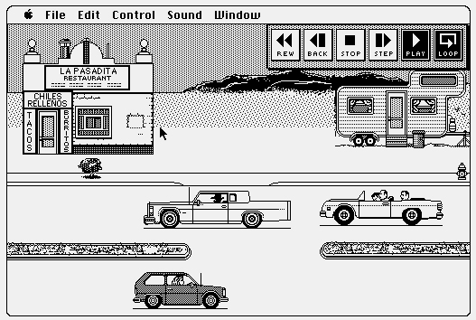 came out on the Macintosh. It was the ancestor of Macromedia Director (1991), whose source code, in Lingo, was open (visible and modifiable). I made my modest début in programming by looking over other code and then modifying it to suit me. At the time, I was mostly using the computer to create pixels screens, which I would code, then print using a little A4 laser printer, which I would enlarge to create serigraphy typons. It was way more affordable than Lettraset. The teachers only looked at one’s results and did not care if we used “traditional” means, like photocomposition, or computers: we were free to choose. At any rate, since it was the very beginning, digital was perceived as insignificant—only two or three weird guys used that junk. My first paycheck came from a computer course I gave to my own teachers at the Arts Décoratifs!
For example, there was this poster created for a fanzine named Tauto 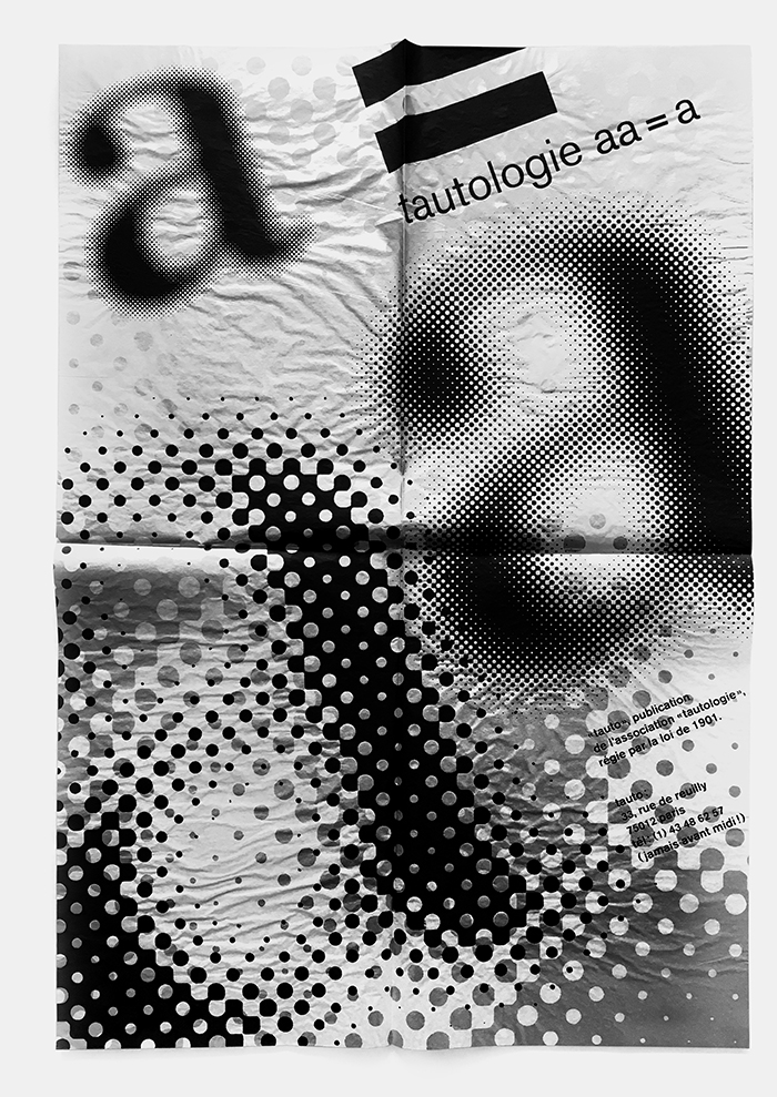 (as in tautology) that we made with several Arts Déco students. I used the computer to create a variety of screens in different sizes and forms. Then we printed the images in the screen-printing workshop.
Cultural CD-ROMs
In 1990, together with Emmanuel Olivier, who was two years ahead of me in industrial design, and who was becoming an excellent coder in Lingo, we founded our company, Index+, while I was still a student. The Yvelines prefecture had contacted us about creating an interactive terminal and I thought it would make a good thesis project for my diploma. Half of the work consisted of creating a fairly classic visual identity—a logo, booklets, etc.—the rest was onscreen (using a Minitel server, an interactive information terminal and a video clip). The result was totally unexpected for me: the thesis committee at the end of the year only graded me on the printed portion of the work, since they judged that anything onscreen could not be considered as graphics! So I was only able to scrape by for my diploma, thanks to video maker Michel Jaffrennou who defended me to the other jury members, explaining that it was possible to be “creative” onscreen! I followed up with a written graduate thesis on the theme of digital interactivity, and, one year later, I managed to obtain a very good grade.
When I left the “Arts Déco,” I found work immediately because I knew how to use QuarkXPress. They didn’t even look at my book, or ask me what I had done before, they took me on immediately. I asked for a salary which sounded really high to me and they just said yes. In 1992, all the major agencies in the world ;that is to say, Paris, New York, Tokyo— all understood that it was the wave of the future and they all began using QuarkXPress. All graphic processes began to move to digital: designers, photoengravers, printers, et al. Photoshop (1988) made its appearance while Macromind Director (1991), derived from VideoWorks (1986), remained dominant in the field of interactive applications because it was cross-platform and relatively easy to access, like Unity (2005) is today. There were also other softwares, such as HyperCard (1987), which only worked on Macs, and only in black and white.
In the beginning of the 1990s, the market for cultural CD-ROMs grew exponentially and became quite large in the United States, Japan and France. Index+ developed as well, and became one of the benchmarks in the Francophone cultural market. We worked a great deal with RMN (Réunion des Musées Nationaux), on projects such as the CD-ROM Moi, Paul Cézanne,  a sort of interactive catalogue whose purpose was to show the exhibit. It was created on Director in 640 × 480 pixels, VGA, 256 colors—really rock and roll… On such small screens, everything is quite limited, we constantly asked them to reduce the quantity of text. We used a lot of Helvetica, Univers and Frutiger. Frutiger worked particularly well onscreen, because at the time there was no antialiasing. Sometimes we would optimize the contours of the letters pixel by pixel; it was very fastidious work and so few people noticed the difference! We didn’t use much bitmap
 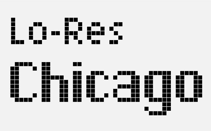 type, since it was too pronounced. It was also very complicated to render the colors of the paintings because we only had 256 colors with which to work. Consequently, each image had its own color palette, and we reserved sixteen shades of grey in the palette, which enabled us to smooth the characters onscreen. There were also interactive elements, voice-overs, plates, we really pushed the limits! It worked out very well because these objects were fun and new, even if they cost as much as a video game and required a CD-ROM reader (which wasn’t included in most computers at the time). Undoubtedly, only a few people really got a look at them…
The advent of hypertext links encouraged us to create non-linear reading systems. For the CD-ROM Yves Saint-Laurent ; 40 ans de création (1996), we created a hypertext environment where the reader could navigate from fragment to fragment. However, since it was all interconnected, they only had to click on “next,” even though we had really driven ourselves crazy imagining an interface with links, and flashing buttons that managed the hypertextualization, and so on.
Plastic Pancakes
These first CD-ROM catalogues were in fact slideshows of static images, activated by the user. I was then able to explore other directions with Au Cirque Avec Seurat (“At the Circus with Seurat,” 1996), 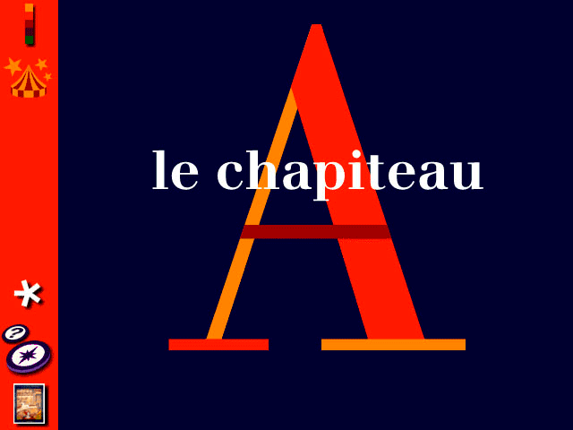 where I only had to deal with one work. I worked closely with the author, Frédéric Sorbier. I designed it as a documentary on painting for children: something fairly dynamic, with strong colors, only a small amount of text, music and lots of interactive animation. The reader could not move to the next level until they had managed to complete the action requested (I was heavily into video games at the time). It was very staged, very audiovisual, unlike the CD-ROMs of other museums, which just provided simulations of the print catalogues, with static pages where you set your grid in place and just scrolled the content as if it were paper. For Au Cirque Avec Seurat, I had managed to create full-screen animations—I was really proud of that! They were ten seconds per minute animations, coded on one bit, so they were very light, and dynamically colored in real time. Since they were in constant movement, the eye cannot perceive the aliasing; still, it required a lot of improvisation. I had read a certain amount of books on the perception of images, on the persistence of vision, which were of great help to me. What was problematic was the rapport of scale to the work. The RMN were able to supply high-definition scans (which would be laughable by today’s standards), which enabled one to zoom in on the canvas to the point of being able to see the brushstrokes. I was deeply invested in this project and the RMN recognized that I had made an essential contribution: they consented to include me in the credits, even though at the time, graphic design was never usually credited. As soon as things went digital, it was as if there were no more authors, it is quite curious…
Then I left for Austria where I had the opportunity of working on a CD-ROM on Sigmund Freud. We brought in someone specialized in the adaptation of books into film scenarios. The first step was to make a flat storyboard: each of the twelve thematic chapters corresponded to an immense sequence. 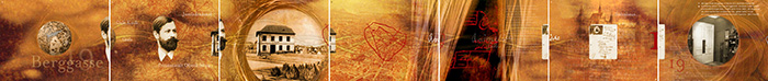 What we displayed was simply a zoom of the sequence which we moved horizontally depending on the position of the mouse cursor. These spaces were then superimposed upon each other, thus one could vertically jump from one chapter to the next. It was a system that I subsequently used frequently. In the 1990s, one could clearly see the difference between artistic directors with a print background who were simply adapting print formats to the screen and those who had come from other spheres, such as video gaming and audiovisual.
I also worked as Artistic Director at Hyptique, where we created a CD-ROM on Marcel Proust (1999) for Gallimard. At the time, Wikipedia (2001) did not exist yet, and CD-ROMs constituted a new sort of encyclopedia with an (almost) infinite capacity. Moreover, it was a sales strategy as advertised on the back of the box: “3,000 photos, thirty minutes of video, forty minutes of music, 300 selected pieces, eighty thematic files, etc.” For this project, we wanted to show Proust’s different facets. So there were three circles whose elements could fold and unfold depending upon where you clicked. The management of typographical sharpness was very limited. We could, for example, forget hyphenation. We had been working with Garamond (we were working with the La Pléiade editions!) and it required many tries before finding which version was the most readable onscreen. It was one of the first times where we were able to integrate video interviews with historians and artists, but in eight bits, with ten images per second. One had to persevere!
All these CD-ROMs were selling decently, but they were never profitable since they were very expensive to make. At the FNAC, they didn’t even know in which section to put them! They had ISBN numbers, but they didn’t want to put them with the books, because they were seen as plastic pancakes, so they put them with other CD-ROMs... but in France, the other CD-ROMs were video games—that was OK, but, in Asia, they were mostly erotic films! I still wonder how many times our Proust CD-ROM had ended up in the X-rated section! I worked with those CD-ROMs for a decade, in 640 × 480 pixels and 256 colors. When you consider today’s smartphones, which change format and resolution every minute...
With the advent of smartphones, ePubs, etc., the multiple file formats continued to complicate things for paper publishers, who understood little about the medium, and to whom many promises had been made. They didn’t care, and did not see their financial worth. With Index+ and the other companies for which I worked, we were able to do many things thanks to publishers like RMN and Gallimard. Today, they have been totally passed over by contemporary issues: their “thing” is limited to the audioguides in museums. Even though, with the Escape Room fad, along with other geolocalization games, a variety of different experiences are coming into being.
World Wild Web
As cultural CD-ROMs were developing, the Web was becoming more mainstream. This created a real panic for the classical publishers for whom I was working, because it was all free. Around 1997–1998, thousands of companies started up in response to the Web becoming fashionable. It was a jungle: companies spent millions, enormous projects were created, incredible things… which in the end all came lamentably crashing down in 1999, with the bursting of the Internet bubble. It all hit the fan, first in the US, and, six months later, in France. The major publishers confirmed that it was all over. For them, it was a fad like foosball, or pinball machines, i.e. it would always be out there but would be confined to a niche market. I did not believe that. In 2000, along with Arnaud Dangeul, Étienne Auger and Pierre Wendling, we created Incandescence, a creative studio oriented towards the digital. Each time we went to see a bank, we were shot down because, [according to them] we were “high-tech” and the Web was over. It was also at that time that I began to fool around with HTML. I got the logic but I had the impression of having lost the bit of finesse that I had managed to acquire with CD-ROM Media and all I had learned over the last decade. Technically, it was too hard-core, you couldn’t do anything anymore ;no specific fonts, very little interaction or animations, almost no control over form—nothing.
Finally I stopped. I told myself that I would work differently, with other technologies besides those of the Web. I began using Adobe Flash (1996) when Issey Miyake decided to work with Incandescence in 2000. We didn’t have the budget for a developer so I set my hand to it. Since they only wanted to sell the product in their boutiques, the objective was simply to retranscribe each season’s fashion show on the Web. 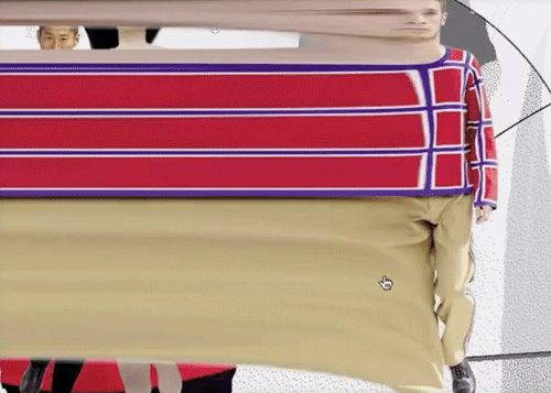 They understood that there were more interesting options than simply uploading the video of the show to the Web (something that, at any rate, was impossible at the time), or reproducing the paper catalogue for buyers and professionals, with very simple photos of clothing and numbers underneath. They wanted an adaptation designed for onscreen media, and I had carte blanche. Some seasons required as much as three months of work, others, two days, the pay was the same. They didn’t know it, but for me, it was an exercise in style, and, for each new collection, I gave myself a new constraint. For example, never having the need to click; the user had to move the mouse, blow on the mic, simply sit in front of their screen, etc.
I played with the technical limits of the medium. For example, for the fashion show of the 2005 Women’s Spring/Summer Collection,  I reduced the amount of video montage (twelve minutes) to a resolution of 20 × 13 pixels, then I reenlarged it to full screen. The result was very pixellated but one could still distinguish the movements. I also exported the high-definition version of the video image by image onto a server (it took an incredible amount of time) numbering each of the twenty-five images per minute. When I clicked, I would recover the corresponding HD image in Flash, which I would upload and display in full screen over the pixellated image. It was a trick: at the time, you couldn’t read videos in full-screen mode, this was before YouTube (2005). It was incredibly successful—there were a million connections on the same day. The Japanese called us to ask what was going on, they thought we had uploaded pirated movies to their server! In reality, we were written up in the Macromedia newsletter as the “website of the month.”
The last show on which we worked was also the last collection by Naoki Takizawa, for the fashion show of the 2005 Women's Spring/Summer Collection.  He wanted “to leave the page blank for the one who would follow.” We did the same on the Web—the show was only readable once. At the end, everything went totally white, even when you returned to the site (thanks to a little cookie). The sales department were very doubtful, but people were migrating from computer to computer in order to see it again.
Thanks to Issey Miyake’s Artistic Director, Roy Genty and sound designer Sacha Gattino, we pushed the envelope with our ideas, as long as it was consistent with the collection. We were not even obliged to show photos of the clothes. Sometimes, I found inspiration for new interactions in video games, at the theater, in a film. For example, I remember transposing the mechanics from the Nintendo mini games series WarioWare (2003) for the interactivity in certain seasons. It was a period when I could experiment with a lot of things, I was independent, I was coding, I was pushing my limits. After eight years of collaboration, we agreed mutually to end our working relationship. Now they have a standard website like any other, a type of WordPress template that features the show and a series of very classic photos.
Mobiles and Pulsations
Then, I worked for Nokia with designer Rémy Bourganel. At that time, Nokia were the masters of the cell phone world: they were selling a billion telephones and were coming out with 300 different models per year! What we found interesting was to communicate in a non-verbal manner—without text or images—with the user. We just used little flashes of lights, vibrations, very faint sounds, etc. For example, the way in which luminous or haptic pulsations can convey the urgent character of a message.
We noticed that, during meetings, people set their mobiles face down on the table, and the first thing they did when the meeting ended was to turn them over. So we created a mini vectorial animation, inspired by South Park, which explained what had transpired on your cell during your absence. You could see if the same person had called four times, or whether four different people had called, if they had left a message, or not, etc., and it also generated a funny animated drawing. In my opinion, interface design is closer to product design than graphic design. With a poster, information is conveyed, whether the image is good or bad. With an object, it’s unanswerable if the design is bad; the handle does not open the door, or your chair slides out from under you, making you fall. It’s the same with a graphic interface, it’s an image to be manipulated. if the design is poor, the users are quickly lost and no longer know what to do, they just slide instead of clicking, they double-click when it suffices to move the cursor over a button. Then screens became a bit larger and we finally began to be able to do interesting things with typography. We realized that back-lit screens (unlike e-paper readers like Amazon Kindles) provided audiovisual content and users were far more disposed to view a thirty-second video rather than reading through their 12,000 new SMSs.
At the time, Nokia thought that the whole world would be using WAP (Wireless Application Protocol, a technical standard used in mobiles in the 2000s), and that tactile interfaces could not be compatible with small machines. Apple made the opposite bet and decided to adapt telephones to the Web. Not having seen the iPhone coming (2007), Nokia almost disappeared in six months, and was swallowed up by Microsoft in 2014.
Telling Stories
After the Nokia experience, I realized that everyone had, on the one hand, a computer in their pocket (a telephone), and, on the other, paper books in their library. Even so, their uses were very dissociated. So I set to work on prototypes that would enable us to associate tangible things with mobile applications, instead of seeking to augment paper books with electronic ones. 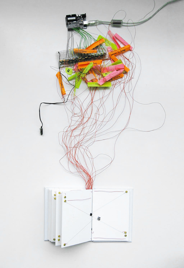 All this resulted in the birth of Éditions Volumiques in 2009, a publishing house and also a studio for the invention, conception and development of new types of books and games. In the beginning, we went to see classic publishers with our prototypes, but they still thought that digital was the enemy. However, our efforts were of great interest to the video and gaming scenes. We had developed a technology for the recognition of pawns through the touch screens of smartphones and tablets. This enabled one to pull the reader instantly out of the screen, also enabling them to interact with objects or other players. The unfolding of the game or the narration remains in the physical space, but integrates a screen that guides the narrative and adds animation and sound. We realized that it is necessary to have a beginning and an end so that the reader becomes involved with a story, without it nevertheless being static, and that there would be stakes and sudden twists. As with interactive cinema, which never worked, after having done anything and everything, we returned to something more controlled, written and set as a scenario. Interactivity remains, but it’s more hidden, more camouflaged, less demonstrative. At the moment, we’re working on audio reading; the user reads aloud and it brings up objects on the screen. The plot is linear, but this interaction gives the impression that you are the one who is moving the story along because you have a visual return of what you’re pronouncing. Once you have read everything, you obtain a beautiful animated page. Our games often integrate a generator of missions; some are compiled, but a system introduces an element of variability, of randomness. Each generated mission is linear—that is to say there is a beginning and an end—but there are also different variations that alter the progression of the narrative. The same goes for music, a simple algorithm can determine a sequence based on predefined loops and one does not have that effect of repetition, including the constant repetition of the same sound, which can make you crazy.
Finally, I realize that what gives me the most pleasure is imagining new ways to tell stories, inventing forms of visual, graphic and sound narration, among others. With CD-ROMs, I began with static screens, like for Cézanne, then I introduced temporality and animation with Au Cirque Avec Seurat, then moved onto my experiments with the Web for Issey Miyake. Then I left the screen with Nokia, where everything progressed with manipulation and a physical rapport with objects. Volumique is a good synthesis of all these moments. Whatever the medium and its technical limits, I find it fascinating to manage to tell stories with these technologies and even add a touch of poetry.