With the emergence of variable fonts, foundries have increased their graphic and interactive experimentations in order to better represent and develop the dynamic specificities of this new format. The type specimen, this mise en scène of the specificities of a character, has historically been a singular space for expression and communication imbued with audacity and energy, whether on paper or onscreen. Consequently, a reflection upon the evolution of the representation of the letter by its designers, from ancient times to the present day, would enable us to discern what elements have been perpetuated, renewed, or when radically innovative forms were adopted, through the examination of printed specimens or the practices of moving typography.
Since the 16th century, font foundries have consistently published type specimens, or “proofs,” for new characters, as well as for existing fonts, as incentives for commissions from editors and printers. Over the course of the 20th century, graphic designers became their main prescribers. These astonishing publications increased exponentially, growing ever more complex in proportion to the increasing production of various alphabets. There was also the plethora of signs that complete them, as well as versions in various writings. Along with the presentation of all the characters of the font and specimens made up in the various point sizes, weights, and styles, sometimes including an example of their application, these publications also featured several vignettes, ornaments and fleurons, even “showcases” or “all-purpose” engravings. These practices have continued despite the advent of photocomposition, the almost complete liquidation of traditional foundries, and the arrival of digital printing. Indeed, even the term “foundry,” which has continued to be used, has assumed a largely symbolic significance. Although there have been few systematic analyses of the tools of commercialization and promotion used by foundries, they do make up a highly significant corpus that illustrates the preoccupations, biases, and evolutions of typography, making them a precious resource for historical research, one that increases the appreciation of this discipline as a sphere of creation in its own right.
The Invention of the Type Specimen
as an Aid in Type Selection
As of the late 16th century, type foundries that were independent of publishers and printers began to make their appearance throughout Europe. One of the most renowned, Egenolff-Berner, was located in Frankfurt, which, from that time on, was a Mecca for the worlds of publishing and typography. In 1557, Jacques Sabon, a Protestant French typographer who had fled the wars of religion, began working at Egenolff-Berner and later took over as head of the enterprise in 1571. The foundry was generously provided with French fonts from Claude Garamond, Pierre Haultin and Robert Granjon. In 1580, after the death of Sabon, his widow married Conrad Berner, who in 1592, published one of the first type specimens destined for a print shop clientele. 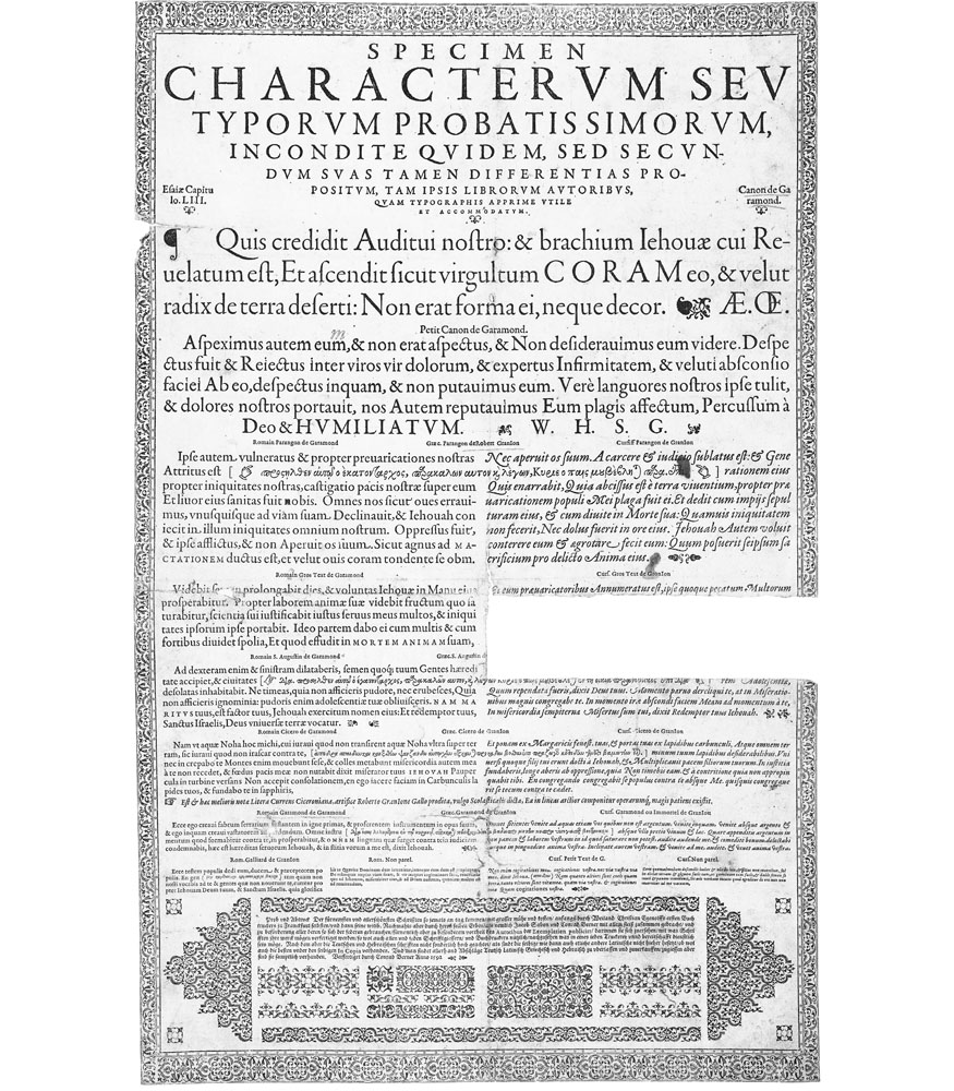 The aim was to facilitate the selection of the font with which their work would be best accomplished. The roman fonts presented were grouped under the appellation Garamond, and the italics were attributed to Granjon. This new association marked the beginning of the “roman/italic” coupling as necessary to all typographic systems and the basic corpus of a font. The Egenolff-Berner specimen provides a scale of type sizes—from the Nonpareil (six point) in both styles to the Garamond Canon (approximately forty-two point) for just the roman—with both styles being separated into two equal columns. Overall, it constitutes a dynamic that had not been seen previously in the exhibition and promotion of typefaces, representing a true effort in graphic design, created to exercise a conscious effect on its readers.
From Elsevier to the Enlightenment
Barely a century later, in 1681, the widow of Daniel Elsevier decided to put up for public sale the punches and matrices engraved by Christoffel van Dijck that were left to her and, to that end, she had a small public poster 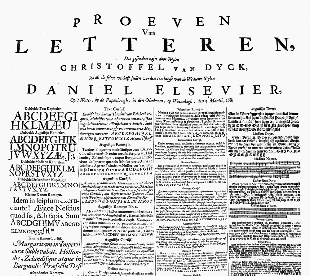 printed that reproduced forty fonts, roman and italic, and one gothic, eight models of fleurons, as well as staves and musical notes. Examples were set out over four columns, from large point sizes to an unprecedented register of very small point sizes, and a “Pearl” (four point), at the bare limits of legibility. This document attests to the desire of the Dutch to impose their methods of publishing by playing precisely upon the elements that made it distinctive and dynamic: printing in small formats with a renewed ease of readability. In the 18th century, it was the Dutch presses that put out the works of the Enlightenment that would inspire the French Revolution: their clandestine circulation was facilitated by the format and quality of their type.
During the Enlightenment, Pierre-Simon Fournier, a printer, engraver and type founder from Paris, contributed to the Encyclopedia 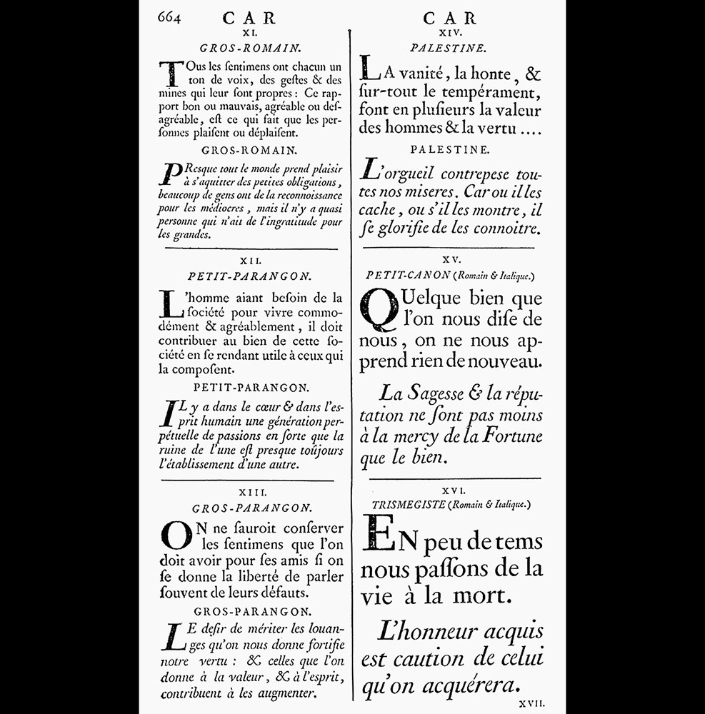 of Denis Diderot and Jean le Rond d’Alembert, overseeing much of its layout and authoring the extensive “Print Letter” entry. It attests to his comprehensive knowledge of the history of typography, its techniques, and the importance of the foundry, whose praises he sings, with of course a mention of his own letter creations. At the end of the entry, he provides a list of examples of all roman and italic characters in use in printing. It covers three pages, including a beautiful double page that includes the large point sizes, and is presented as a summary of his own type specimens. Like his essayist, scientist and philosopher counterparts, Fournier is defying royal authority: he chose to use the Paris foot as his type scale rather than the royal foot, used for the Romain du Roi (the King’s Roman) font of the royal printers (Imprimerie Royale), who had finally published their own complete type specimen. Following this, Fournier published his renowned two-volume Manuel Typographique (1764–1766), which introduced the concept of typographic points. The second volume includes a catalogue of fonts associated with an ensemble of vignettes that enable one to compose ornamental motifs in proportion to the body size, geometrical lines, and modular layout of the letters used, allowing for infinite variations. His rocaille esthetic resulted in their falling into obsolescence, but the principles upon which they were based became part of the collective memory of the world of typography and would provide the basis for many systems since.
Ornamental Abundances
The famed Didot family of printers and type founders, who have been active as of the end of the 18th century and beyond, had little fondness for type specimens. They chose to rely on their most beautiful publications as proof, where entire pages, created by Pierre or Firmin Didot, were dedicated to the glory of the type characters used. As head of the type foundry of the Imprimerie Impériale, Firmin created a proof of his Didot Millimétrique, 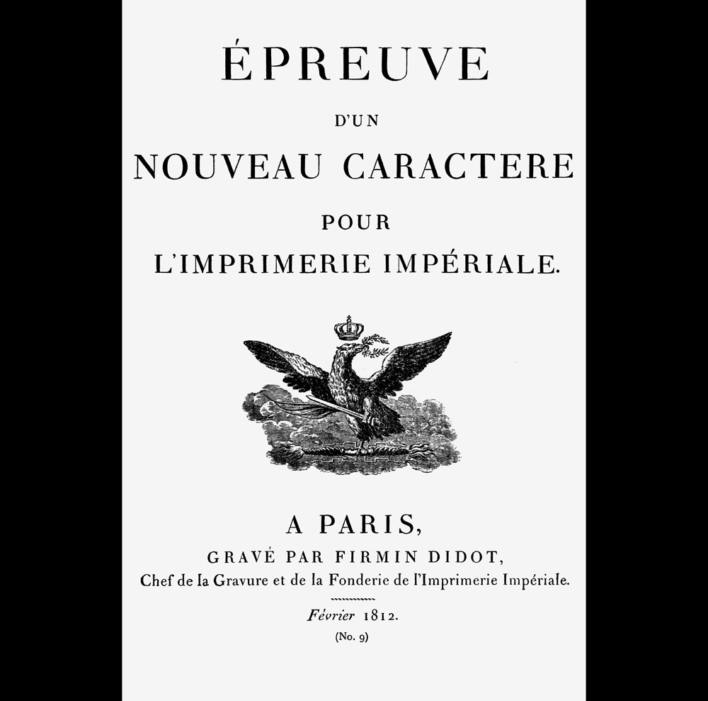 which was intended to accompany the commemo rative ceremonial book of Napoleon’s coronation. It shows his typography, founded upon the metric system, a revolutionary response to the Romain du Roi; however, the fall of the empire put paid to the enterprise. Instead, he focused his efforts on popularizing his “English” type, a particularly dynamic script that was the subject of a type specimen.
 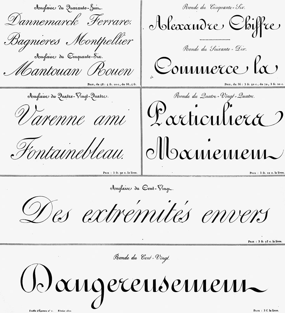 It is regularly featured in its applications, and was finally approved by teachers during the Third Republic, who used it as the model for common writing.
The Industrial Revolution saw a prodigious rise in type foundries. The impetus was towards creating type that transcended the usual boundaries of typography, all the more so because large point sizes intended for posters needed to be engraved on wood. 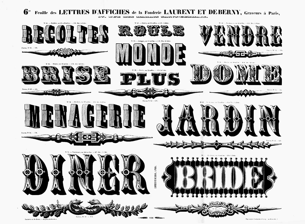
 This creation was still permeated with Romantic fantasies, but the development of the plethora of “Normand” and “Egyptian” series, and the first “Antique” types, marks the passage into the advertisements of the Industrial era, with their direct messaging and urgent modes of address.
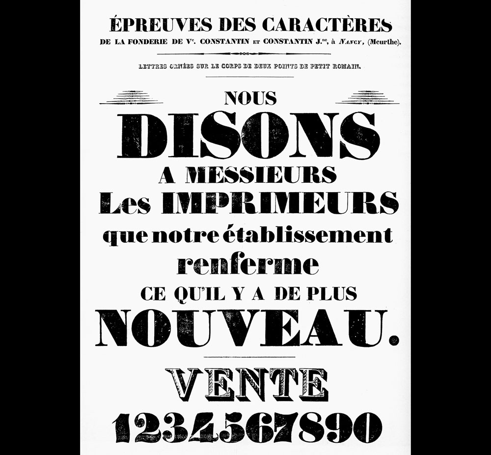
The foundries distributed a considerable amount of promotional materials concerning type, as well as all the “visuals,” whose typography can ensure reproduction and use. Albums and catalogues were presented as immense type libraries, veritable encyclopedias of the images of their times, containing the emblems of a culture (flags, medallions, money, etc.) as well as representations of the elements of a lifestyle (tools, vehicles, instruments—such as medical or musical, shop fronts, etc.). 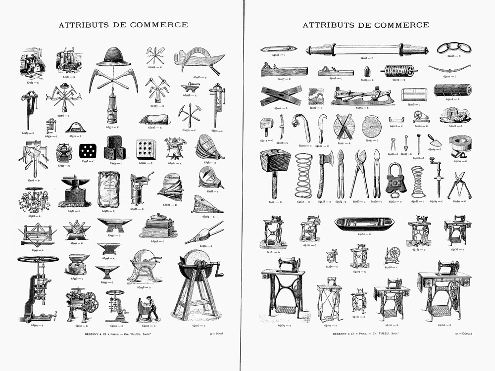 In the updates offered by these compendia, one can discover entire series of varied engravings, which do not seem to be organized in any perceptible order, and which seem to illustrate the Comte de Lautréamont’s aphorism: “As beautiful as the fortuitous encounter of a sewing machine and an umbrella on a dissection table.”11 Isidore Ducasse (known as Comte de Lautréamont), Les Chants de Maldoror, (Brussels: Albert Lacroix), 1869. It provided inspiration for Dada and the Surrealists, as seen by Iliazd’s posters for the Soirées du Cœur à Barbe, made up solely of motifs from foundries.
This great age of foundries yielded many examples of applications, leading to a style that defined a nation and an era: Georges Peignot’s publications, including the monumental Album d’Application des Nouvelles Créations Françaises in 1901, 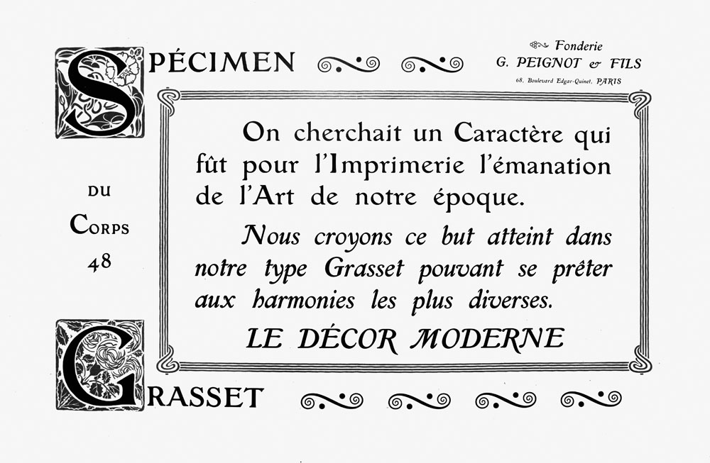 marks the zenith of works that promoted French Art Nouveau in typography.
Typographical Diversions
This profusion waned after the advent of the First World War. In the wake of the aftermath of the conflict, foundries were obliged to focus upon their craft and abandon their vast repertoires of vignettes, all the more so because the habits and tastes of the previous decades had been profoundly upended. In order to revamp their offers, they turned towards the propositions of the Moderns, implementing characters with audacious forms, such as Futura and Bifur. Regarding the latter, its designer, A. M. Cassandre, conceived a Modernist specimen manifesto possessed of novel kinetic qualities, published by Deberny & Peignot in 1928. Bifur is a modular font, made up solely of capital letters, each of which is “reduced to a schematic form, to its simplest expression.”22 Adolphe Jean Marie Mouron (known as Cassandre), “Bifur, caractère de publicité dessiné par AM Cassandre,” Arts et Métiers Graphiques, 9, January 15, 1929. The result is a geometric typeface that Cassandre claimed would contribute to modern architecture, ornamenting the pediments of buildings, and even (why not?) illuminating the nights of Paris with its many variations. However, even though his specimen is on a par with the best creations of the avant-garde movement, the worlds of printing and advertising were less than enthusiastic.
In tandem with the release of Bifur, the foundry of Deberny & Peignot published the sample booklet Divertissements Typographiques (“Typographic Diversions”), edited by Maximilien Vox. The range of available characters with the clean lines of Art Nouveau type were offered up in an attractive package with a dynamic layout. The “diversions” included many examples of applications that showcased the production of the largest French foundry, which also sought to carve out a place on the global scene in the face of English competition and the emergence of machine compositions being distributed by the Linotype and Monotype firms.
Be that as it may, the principles of Divertissements Typographiques entered the annals of typography. Over the following decades, all the foundries called in graphic artists and redoubled their efforts to develop new type that provided models of use, along with peripheral textual and visual elements that aimed to bring to life the spirit of the type and its referential universe, transcending mere reproduction.
Technical Upheavals
In 1954, the Deberny & Peignot foundry commissioned Adrian Frutiger to create the Univers font in order to address the challenges of photocomposition. The type was also made to be set in metal and it is one of the links that bridges the old world of punches with the new one of photographic matrices.33 Alice Savoie, International Cross-Currents in Typeface Design: France, Britain and the USA in the Phototypesetting Era, directed by Paul Luna, Fiona Ross and Alan Marshal, Department of Typography and Graphics Communication, (PhD diss., University of Reading (UK), 2014. While Univers remains a classic printer’s font, its conception in twenty-one series, distributed according to a numerical nomenclature, makes it a distant ancestor of variable type. The specimens 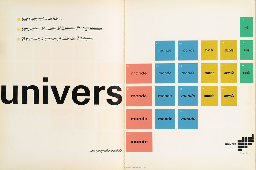 published upon its release played upon a union between fixity and animation, a set of traits highly regarded in Swiss styles. A constant layout grid creates a structure for the presentation of each series, making it appear as if each superimposed variation of Univers better reveals its overall coherence.
In 1967, Wim Crouwel published an astonishing type specimen 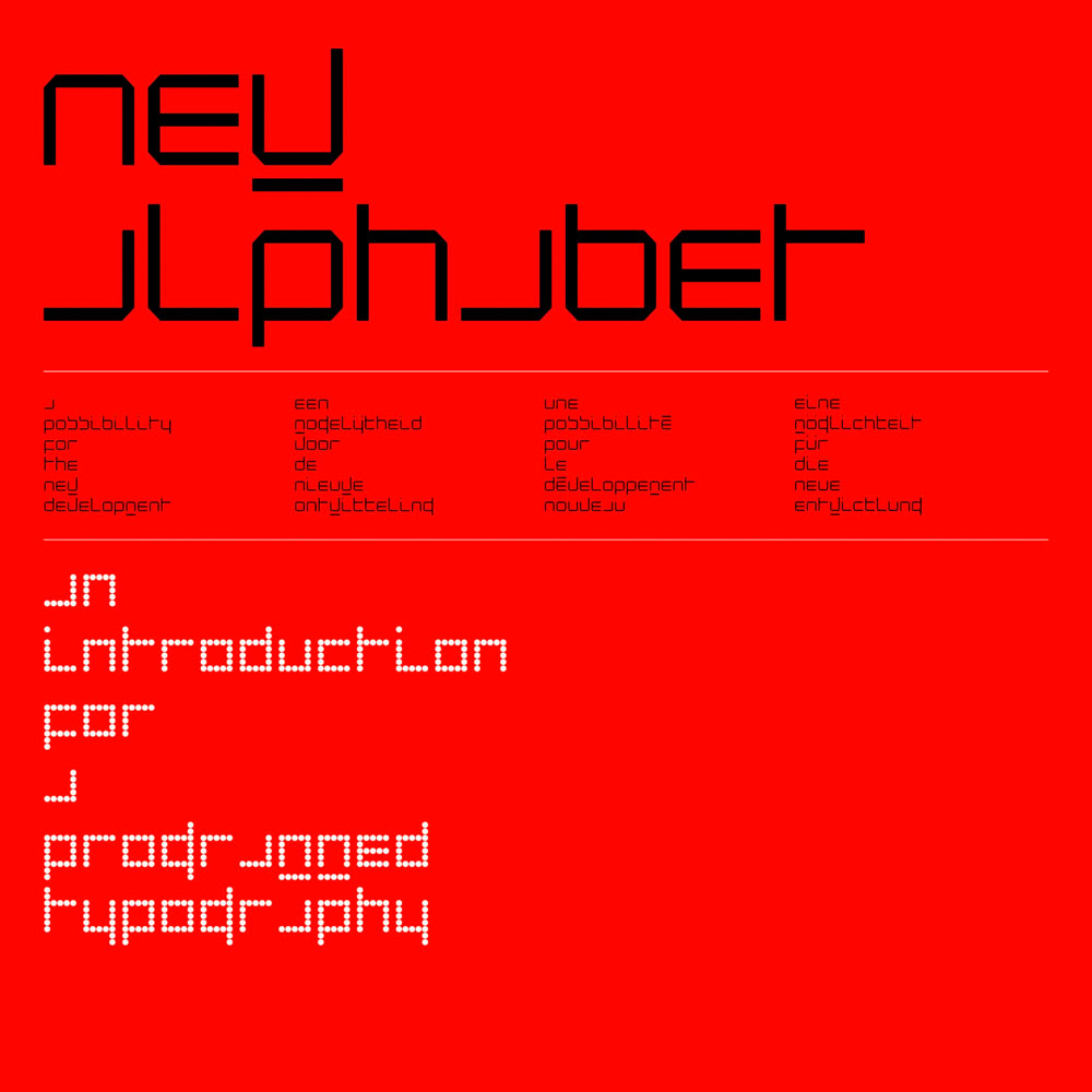 in the form of an illustrated brochure to promote his New Alphabet, an experimental type intended for the first screens and photocomposition equipment. The principle of reproduction refers to the cathode-ray tubes of television, that allowed for only a very antiquated approach to the letters. While a large visual of an astronaut in space concluded the publication in order to emphasize its modernity, New Alphabet seemed to be fairly unworkable, even though Crouwel used it for a few posters for the Stedelijk Museum. At the same time, another screen font made its appearance, OCR-A, whose forms were shaped based upon the machine’s capacity for optical character recognition. New Alphabet is one of the twenty-three digital fonts acquired by the New York MoMA (Museum of Modern Art) in 2011, as part of their Architecture and Design collection.44 New Alphabet was digitalized in 1996 and, in 2015, Joshua Koomen developed an application on the Web (http://witregel.nl/newalphabet/), that enables one to experiment with all the parameters possible for it. It exists as the variable font Nu Alfabet by TipoTipos.
Photocomposition and Print Magazines
The International Typeface Corporation (ITC), launched by Aaron Burns, Herb Lubalin and Edward Rondthaler in New York in 1970, is the first “foundry” that only offers fonts destined for photocomposition. A major portion of their production was dedicated to revivals, even as designers like Ed Benguiat, Tom Carnase, Matthew Carter, José Mendoza or Hermann Zapf were creating new fonts. The company distributed specimens of each creation: covers in three colors with the name of the font and a letter, like a sign, composed in a large point. A set of pages followed that featured their variations in body, weight and style. In total, almost sixty booklets were made in the same narrow, vertical format, unusual in this genre. 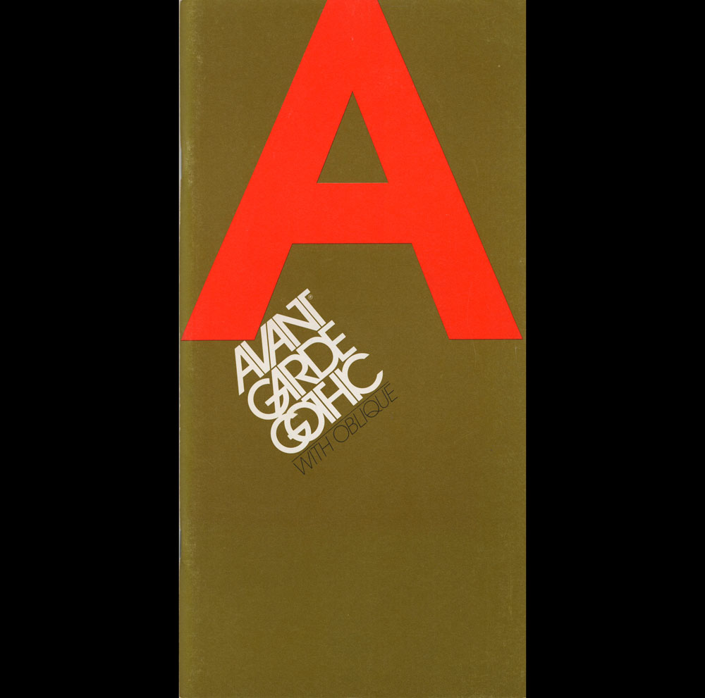 In order both to associate themselves with the traditions of the foundry and the process of transcending them, ITC began publishing the magazine U&LC (Upper & Lower Case), destined to become a living catalogue of their productions, as well as providing a perspective on international graphic creations. U&LC enjoyed a wide circulation and remained a benchmark worldwide for two decades.
The principle of disseminating the production of a foundry through a periodical dedicated to graphic design and typography was also adopted in the 1980s by Emigre Graphics who published an eponymous fanzine that gained stature as an important magazine with a global audience. Experimentation with fonts distributed by the foundry was a dynamic aspect, to say the least, at the magazine. It became part of a New Wave tropism, where the layout underwent a level of deconstruction that often pushed the limits of readability. To wit, it is significant that the issue of Emigre entitled Do You Read Me? (1990) marked a return to a certain tradition. Within its center it had a folded insert, a poster that presented the Emigre Fonts according to the framework of a classic specimen. 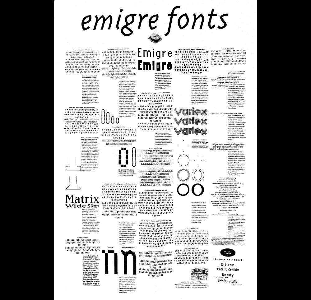
The Emergence of Personal Computing
The profusion of fonts that emerged with the use of the first Macintosh computers (1984), and Fontographer (1986), DTP (Desktop Publishing) software and the possibilities presented by the PostScript programming language (1982) reflected the mania created by the democratization of the drawing of characters. Among the memorable experiments of this period one must mention the FontShop platform, along with the FontFont foundry, launched by Erik Spiekermann and Neville Brody.
The first font promoted by FontShop was Beowolf (1990), created by Dutch designers Erik van Blokland and Just van Rossum.  It was a particularly original experiment because it uses some random instructions from the PostScript language allocated to the positions of control points to generate different letter forms with each printing. This singular place accorded to chance, totally novel in typography, earned Beowolf the attribution of the term “living font” upon its appearance. Beowolf also demonstrated the nature of digital fonts: geometric data and instructions (programs).55 Erik van Blokland created the animation Is Best Really Better, to present the Beowolf font in color for the exhibition Digital Fonts at the New York MoMA, in 2011. The MoMA acquired twenty-two other fonts along with it and they are now the core of their Architecture and Design collection.
Between 1991 and 2000, FontShop International published the typographic magazine Fuse, edited by Neville Brody and Jon Wozencroft. 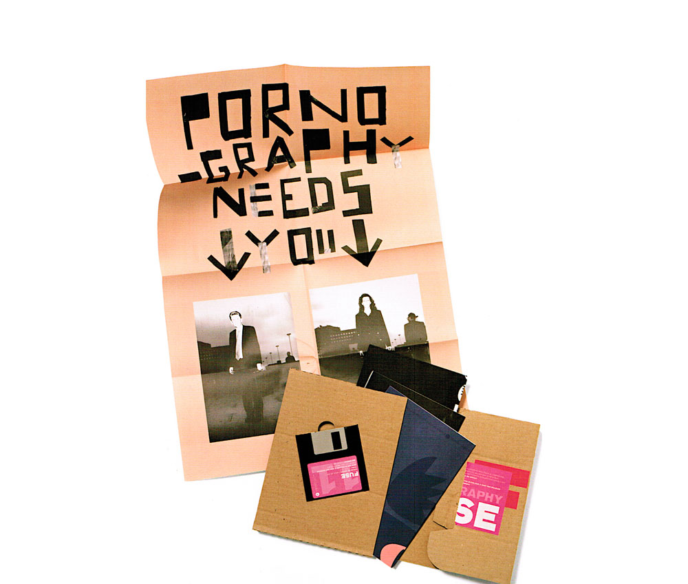 Each magazine delivery arrived with a diskette in a standard brown paper wrapper upon which the name Fuse was printed in a different color; it contained at least four experimental fonts and four specimen posters. Many of the Fuse fonts were almost illegible. As Wozencroft stressed in the first issue: “abuse is part of the process.” The various issues questioned thematics linked to communication ;from the secret alphabet of runes to digital typography, from disinformation to exuberance. A total of 100 posters and 114 fonts were produced.
Technical Challenges of Digital Specimens
At the same time, the Web emerged as a new space for the commercialization and development of type that required the development of technical systems that would make it possible for fonts to display in Web browsers, besides merely as images from matrices (JPEG, GIF, etc.).66 Overcoming the technical limits of the HTML/CSS web languages that prevent one from dynamically uploading unavailable fonts on operating systems (OS), technical solutions such as sIFR (JavaScript + Flash, 2005) or Cufón (SVG + VML, 2008) anticipated the development, around 2007–2008, of the standard CSS @FontFace. Also see: Peter Biľak, “A Brief History of Webfonts,” Typotheque.com, October 2019, http://b-o.fr/bilak. Unlike printed specimens, it was now possible to compose text directly onscreen, to dynamically increase or reduce font size or change its color.
In September 2016, during the ATypI (Association Typographique Internationale) conference in Warsaw, Adobe, Apple, Google and Microsoft announced an extension of the OpenType format, under the appelation Variable Fonts. The growing use of web fonts and the need to work with smaller and fewer files were major factors that guided the research into this new format, which would enable a font with all its variants to be contained within only one folder, thus simplifying the installation of fonts on the Web, and increasing the speed at which pages could be loaded. This new format integrates a system of masters that could be consulted according to different “axes,” like the Multiple Master system of the 1990s.
However, the paradigm of variability requires specific didactic work in order to be understood. The typographer and webdesigner Nick Sherman, who participated notably in the creation of the Fonts in Use directory (2012), went on to launch V-Fonts, a site that inventories a wide range of variable type, and invites people to test them.77 https://v-fonts.com A stroll through this universe provides an opportunity to experiment with the dynamic aspect of fonts, which the user can activate with a cursor. One can create continuous variations with up to twenty-seven parameters, be they standardized (weight, set width, body, slant, italics), conventional (ascenders/descenders, optical size, alternates, etc.), or elements more exotic or specific to each project (Darkmode, Distorsion, Wonk, Weirdness, Flair, Volume, Shatter, Glow, Stencil, Chew, Bite, Rotation, Displayness, Gap, Inktraps, Chisel, Casualness, etc.). Some foundries went so far as to develop specific tools to manipulate and generate static instances out of variable font files. Created in 2019 by the Swiss foundry Dinamo, Font Gauntlet thus enables designers to visualize various parameters of their works in progress quickly and easily, in an animated colorful format. 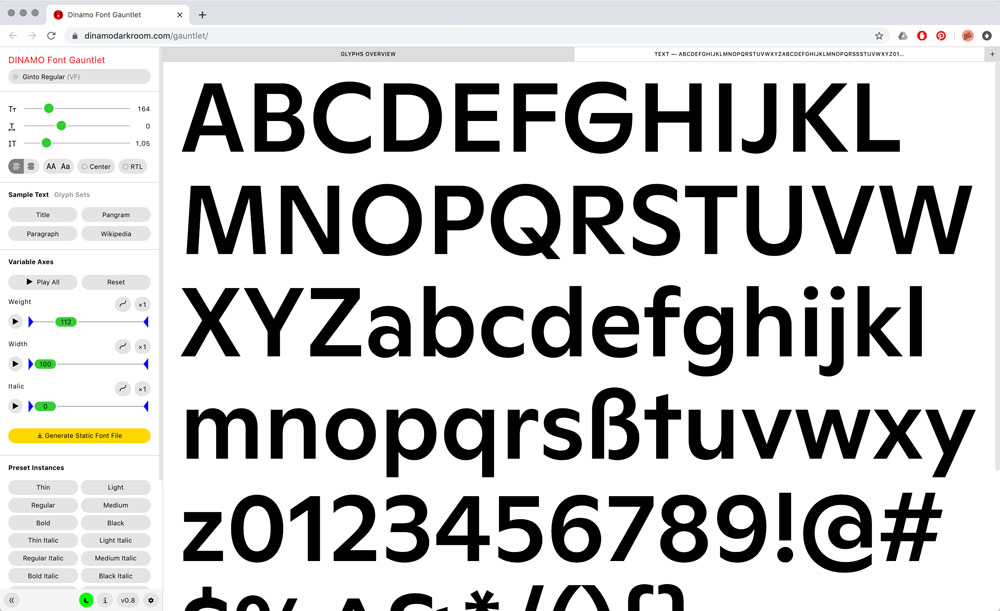 Others, like David Jonathan Ross, produced specially designed technical equipment for complex experimental typefaces such as Gimlet X-Ray (2020), where an online interface enables you to configure the units and colors of glyphs.
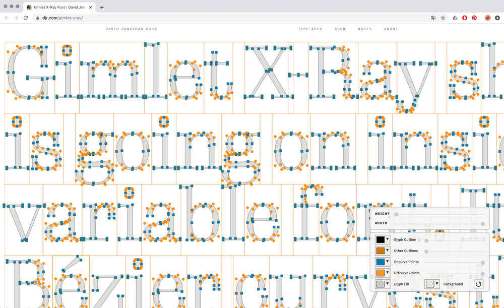
Interactive and Animated Specimens
The printed font specimen is a matter for consultation and thus requires that its future user exert a certain amount of effort to mentally transpose the alphabet before his eyes into another situation. Some foundries that promote the sale of type online, sometimes even for fonts made for onscreen use, such as Production Type or Rosetta, nevertheless continue to produce printed specimens as collectible “goodies.” While digital specimens definitely have their place in the long history of the genre, as well as its fundamentals, they nevertheless remain distinctive due to their immersive and exploratory aspects. The user is in control, almost as if they have already acquired the rights to use the type. The characteristics of the Web, notably its interactivity and animation, are brought to the fore, not only in highlighting the fonts, but also in showcasing its uses, providing details that are inaccessible with a print medium.
In addition, these increasingly distinctive and free interfaces tend to be regarded and conceived as autonomous units, dissociated from the main website of the foundry, whose pages generally adopt standardized norms of composition and e-commerce functionalities. These specific digital objects have thus liberated themselves from the limitations of the content management systems (CMS) on the main websites, becoming areas of interactive visual experimentation that can be easily consulted and shared.
Like the webpage of RT Alias (Razzia Type, 2016)  most of these sites use a simple vertical scroll with which the content unfolds: sets of weights, an ensemble of glyphs, examples of type composition in a variety of point sizes, details of drawings, construction, etc. On more radical lines, the Niko mini site (Ludwig Type, 2019)
 does a workaround the scrolling by presenting content in depth through a zoomable user interface (ZUI) that creates an enlarging effect. This graphic concept is also used in some long articles of the New York Times and originates in some historical graphic interfaces (like Information Landscapes, 1994 or the file management system FSN, 1993).
Other web font specimens use animation as an iconographic element. GT Cinetype (Grilli Type, 2015) is designed around short video loops in black and white, with a grainy analogical aspect reminiscent of film rolls, or excerpts of historical films where typography comes into play as subtitles. In the same manner, the Grilli Type foundry has developed mini-sites with original interfaces for almost all of its fonts, each one relegated to a specific team. The one in charge of GT Zircon (Grilli Type, 2018)
makes use of vector animations in which generative shapes are superimposed; GT America (Grilli Type, 2016)
presents details of a drawing in movement, and illustrations that are part of the font’s mise en scène (sample posters and packaging, etc.).
In 2020, the Future Fonts platform, which distributes fonts in the process of development, pushed the illustrative mode towards a truly immersive perspective when they created an exhibition to commemorate the anniversary of the Fisk Gallery (Bergen) that was linked with three mini websites, pushing the boundaries of the font specimen in the sense that each one of them contained a large portion of the foundry’s catalogue, and not merely one font.88 “HyperText: A Snapshot of the First Year of Future Fonts, with Visuals by FISK,” Future Fonts, February 2020, http://b-o.fr/hypertext Conceived as autonomous experiments at the edge of Net Art, the interfaces for this project, entitled HyperText, work with graphic code from the 1990s. The animations successively evoke popular shop signs, amusement parks (HyperFood), WordArt and other clip art (HyperWeb),
or New Age incantations (HyperAge)
in which the alphabets from the Future Fonts catalogue can be distorted on full screen. Also in the realm of the absurd, the font specimen for Action (Commercial Type, 2016) plays on meta-references by twisting the visual codes of the sites presenting variable fonts, except that several cursors on the page have no effect.
In fact, the many adjustments required by variable fonts incite one to set parameters in real time. This possibility had already been extensively explored by platforms like Prototypo, that enabled one to model a personalized font from a selection of predefined typographical “skeletons.” The font specimen of one of these skeletons, the Spectral, 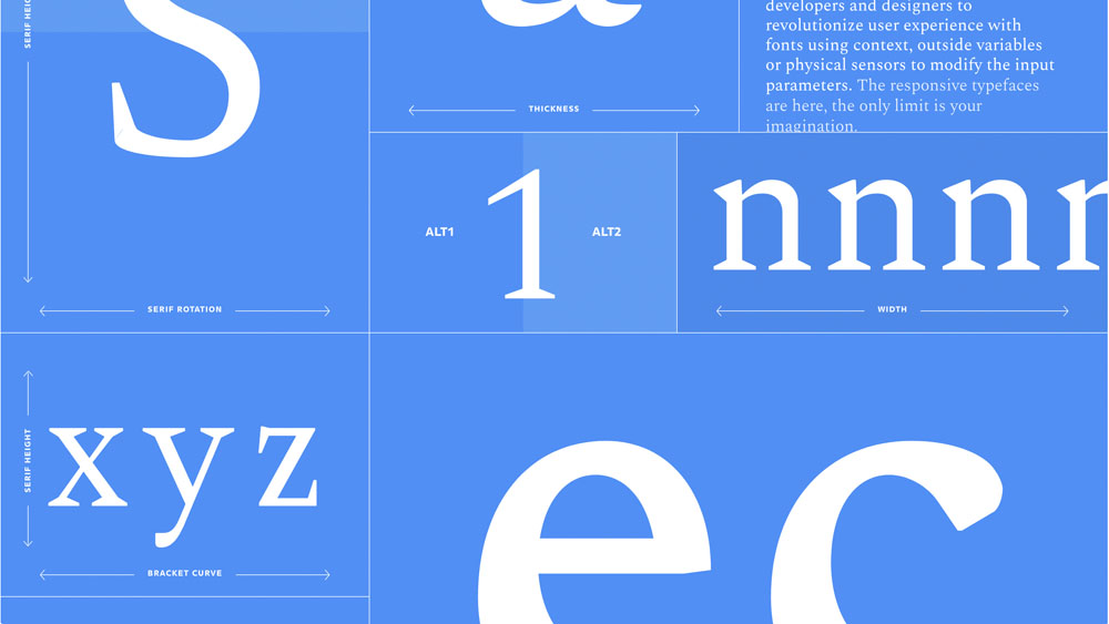 an alphabet initially conceived in 2017 by Production Type for Google Fonts, uses the trajectory of the pointer which, as it moves along, dynamically activates the letters. This principle can be seen in other examples: Scope (Jonas Pelzer, 2018); GT Alpina (Grilli Type, 2020);
 and Fit (David Jonathan Ross, 2017).
 These presentations of the variety of forms in a same family within a limited space (similar to Adrian Frutiger’s Univers) are very similar to earlier initiatives such as the webpage of Panorama (Production Type, 2014), where an interactive wheel enables you to compare different cuts of the font.
 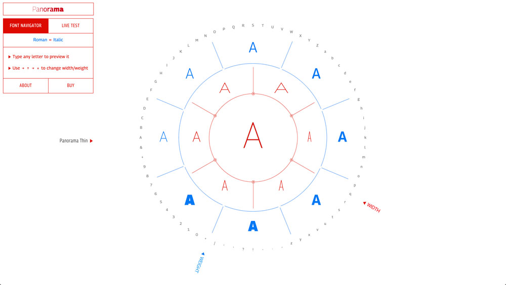 This type of interactive concept is also used for the font specimen of Recursive (Arrow Type, 2019), which includes many modules that react to the movement of the pointer, keystrokes, or cursor movement, revealing several graphic possibilities of the font and providing details of its use (CSS commands).
 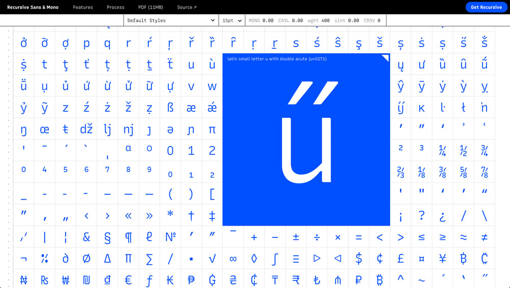 This is a good example of the programmatic nature of digital fonts, which, associated with a variety of transitions and interactions of the web platform (CSS transitions, JavaScript), facilitates the animation of the text. Consequently, many specimens of variable fonts focused upon animation, such as the font Scope (Jonas Pelzer, 2018), which includes a series of animated GIFs that link to interactive HTML webpages.
 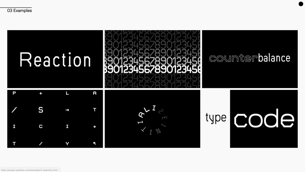 Pioneers in variable fonts like Zeitung (2016), the Underware foundry went so far as to dedicate some of their font axes to animation functions, highlighting these functions on Instagram under the keyword #underwareinmotion.99 http://b-o.fr/zeitung Their experiments, grouped under the concept “Grammatography” on a dedicated website (2019), set out to associate the movement of manual writing (script) and digital technologies.1010 http://b-o.fr/grammato A technical demonstration proposes a variable axis type entitled Miles Davis, which activates three “sub-axes,” dubbed Strokes, that simulate the ductus of a lettering brush.1111 http://b-o.fr/underwarefoundry Underware also entered the field of wearable devices, with, for example, the Grammatographer (2019) project for Apple Watch, where each number displays according to the unity of time it represents (seconds, minutes, etc.). As to the future, the optimism regarding variable fonts must be tempered by their inherent deficiencies. One of the risks, underlined by many designers, lies in the standardization of the letter through generalized font smoothing.
Typographical Diffractions
As for the Dinamo foundry, they made the decision not to propose mini websites for their fonts but rather to vary the interface of the pages of each font. For Diatype (Dinamo, 2018), cursors are configured in the manner of a video player and enable the user to create parameters for animation loops, while other zones of the webpage play up exaggerated movement. 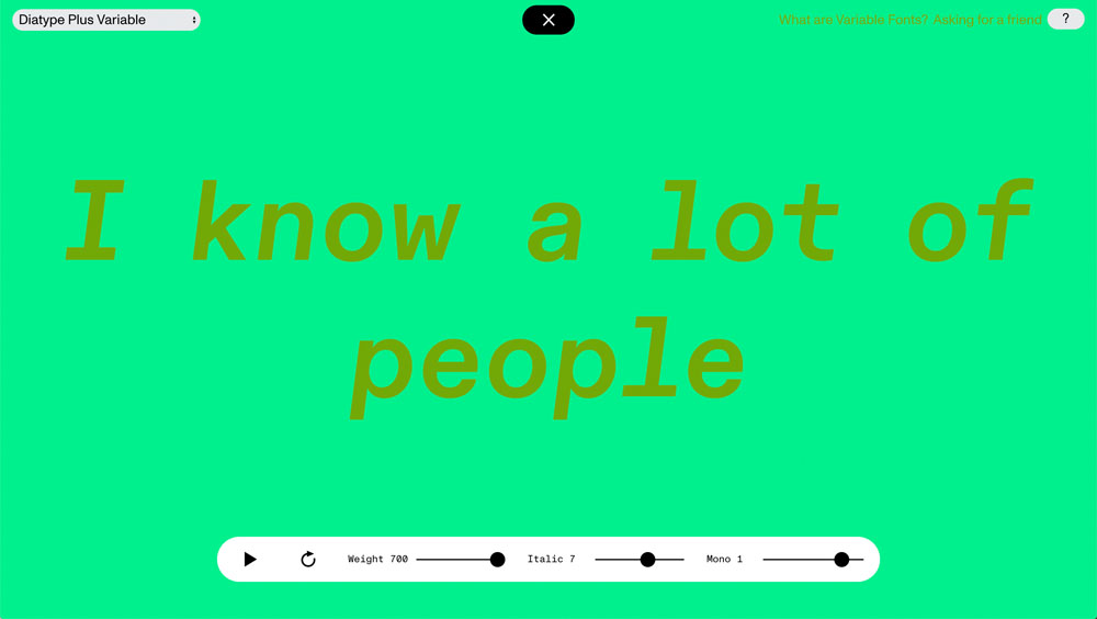 As for the launch page for Maxi (Dinamo, 2020), it offers a 3D animation, a sort of skeleton enhanced with glitter.
 It also features passages concerning the designing of the font, with images and text, which moreover are sometimes better font specimens than the sales webpages.
All of these examples include some sort of diffraction or scattering of the digital font specimen which ends up broken down along different channels: foundry websites, linked blogs, dedicated mini sites, printable PDF files, promotional objects, aggregate websites (V-Fonts, Fonts in Use, etc.), video platforms, social media (Instagram posts and stories, Twitter threads), applications,1212 See the iPad application by Typotheque for Elementar (2011), http://b-o.fr/elementar navigator plug-ins,1313 See the example of the Klim Reader (2017), that enables one to dynamically format a webpage with the fonts of the foundry to improve onscreen readability: http://b-o.fr/klim-reader, or that of the Colophon Foundry Type Tester (2019), created on similar principles, but which preserves the original page layout: http://b-o.fr/type-tester etc., all with content that does not necessarily correspond. While PDF font specimens from the Production Type foundry merely provide a list of text block in varying point sizes, their Instagram account hosts animations with 3D special effects from the 1990s: reflections, transparencies, procedural materials, etc. (Cardinal, 2018 and Tesseract, 2019). Instagram can provide a medium for visual “fragments” from a global promotional campaign. Accordingly, the specimen for Söhne (Klim Type, 2019),1414 See: http://b-o.fr/soehne. Also see the interview with Mitch Paone, the creator of the font specimen, in this issue: “Motion Over Matter.” is formulated around a set of videos which are simultaneously presented on the foundry website, their Instagram account and a video platform. Created with camera shots, they evoke a viral organic universe in mutation, echoing their communication style.
The use of digital technologies does not just mean that the “medium” of the font specimen changes. It is no longer a question of presenting an alphabet by outlining its history, its range of glyphs, its different cut-offs, or referential universe: one must also outline a palette of potential uses and possibilities that paradoxically transcend the usual media differences for typographical licenses (print, Internet, application), since both the animation and multimedia (web to print) approaches transcend these boundaries. New challenges, as much technical as ergonomic and legal, are arising for foundries with the advent of connected objects, virtual reality (VR), mixed or hybrid reality (MR), and augmented reality (AR). The promotion of letters does not amount to a mere matter of diversion, but rather reflects the spirit of an era. In its own way, typography reflects the preoccupations, enthusiasms and undefined uses of a given period.1515 Marian Misiak, Lars Harmsen, Support Independent Type—the New Culture of Type Specimens, (Slanted, 2020), http://b-o.fr/misiak-harmsen It might be suggested that the presentations of fonts are a powerful means of expression that must also bring together a sense of the quality of the font, the dynamics of its variability, as well as the pertinence and coherence of its design within environments that are increasingly prone to shifts and changes.